Checking Site Responsiveness


Published on February 6, 2016
Published on Wealthy Affiliate — a platform for building real online businesses with modern training and AI.
Hello, and Happy Friday!
For many of us, the coming two days will also be work days. =D
With that spirit in mind, I wanted to share a bit of information with you on how to check how well your website will look on different mobile devices (e.g. iPhone 5, iPhone 6, android, iPad, etc).The Why and How of Checking Your Website's Responsiveness
If you chose wisely, you're creating content using a theme that's responsive to whatever mobile device your visitor is using to view your site. What this basically means is that the width of your site will change in accordance to the device's width your site is viewed on.
When your website is responsive, visitors will have a more pleasant experience. If your website is not responsive, visitors will likely get annoyed. The harsh truth is, once they're annoyed, they'll never know how wonderful your site really is. 😢
So, the BIG question: Do you know if your theme is responsive?
If you have a WordPress theme, it likely is. But, if you still want to see how your site looks on all the various mobile devices your site may be viewed on, the following 3 websites will allow you to do just that.
For the most part all you have to do is provide your URL.
1. The Responsinator: www.responsinator.com

The Responsinator allows you to view your site on iPhone 5, iPhone 6, and android (both portrait and landscape modes), and iPad.
Pros:
Easy to use: just type in your URL and your good to go.
Cons:
Ready to put this into action?
Start your free journey today — no credit card required.
You are limited in the number of devices that can be tested.
2. Responsive.is: http://responsive.is/typecast.com

Responsive.is is a simple site containing a tool bar (with devices to be tested) and nearly full screen to preview your site.
The devices which can be tested include: desktop, tablet landscape, tablet portrait, Smartphone landscape, and Smartphone portrait.
Pros:
No need to scroll to find the device you're testing. Just click on the icon in the toolbar similar to the device you're wondering about.
Cons:
The number of devices which can be tested are few and no dimensions are given.
3. Responsivepx: http://responsivepx.com/
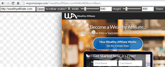
Responsivepx is great because you can test any device. You just need to know the device's dimensions.
Pros:
After entering your site's URL, just change the height and width settings and you can instantly see how responsive your site really is.
Cons:
No preset dimensions are available so you'll need to research the device's dimensions that your interested in testing.
Conclusion
Since you are putting countless hours into your site (or sites), you know how good your site looks from your perspective. You do awesome work and it shows!
But, how about your visitors?
Don't wonder any more.
By utilizing the tools above, you will no longer be in the dark about their experience.
Thanks for reading!
Share this insight
This conversation is happening inside the community.
Join free to continue it.The Internet Changed. Now It Is Time to Build Differently.
If this article resonated, the next step is learning how to apply it. Inside Wealthy Affiliate, we break this down into practical steps you can use to build a real online business.
No credit card. Instant access.