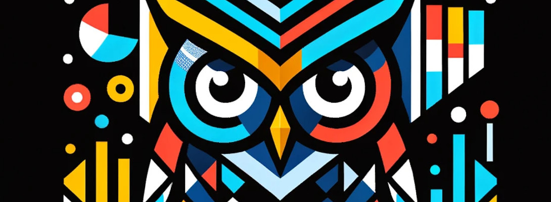
My New Logo
This is the logo I created for my new niche. Appreciate your comments... love it or hate it!
If any of you want to create a new logo, you can just follow the following training available to you conducted by Kyle.
CLICK HERE TO ACCESS TRAINING - CREATING A PROFESSIONAL LOGO
Now with AI and simple editing tools, you can create your logo with a little effort and time.
Go watch the training and try out. You will be surprise with what you can create.
Cheers,
Stanley
Join FREE & Launch Your Business!
Exclusive Bonus - Offer Ends at Midnight Today
00
Hours
:
00
Minutes
:
00
Seconds
2,000 AI Credits Worth $10 USD
Build a Logo + Website That Attracts Customers
400 Credits
Discover Hot Niches with AI Market Research
100 Credits
Create SEO Content That Ranks & Converts
800 Credits
Find Affiliate Offers Up to $500/Sale
10 Credits
Access a Community of 2.9M+ Members
Recent Comments
47
Hi Stan. I think it's beautifully done. My only concern is how large it will have to be, wherever you place it, to be able to read the name. The current trend, particularly on a website, is to keep the size of the logo to more modest proportions. That is just my thought.
You made a great point. I will test out on the website, then make the adjustments. Appreciate your feedback.
Really good, but I feel it might be better to the viewer if the letters were in single faunt colour. Just took me a few seconds to get the options word. Like the design though.
Dougie
See more comments
Join FREE & Launch Your Business!
Exclusive Bonus - Offer Ends at Midnight Today
00
Hours
:
00
Minutes
:
00
Seconds
2,000 AI Credits Worth $10 USD
Build a Logo + Website That Attracts Customers
400 Credits
Discover Hot Niches with AI Market Research
100 Credits
Create SEO Content That Ranks & Converts
800 Credits
Find Affiliate Offers Up to $500/Sale
10 Credits
Access a Community of 2.9M+ Members

It's too busy.
Also, when reduced in size, it can look like a multi-colored mess. Imagine how it would look as a profile image on social media. Also, how it would look as an icon on the browser. (see the WA logo on the browser? simple and easily recognizable.)
Just my feedback. Of course, if you have your valid reasons why the logo is designed in such a way. And how you already thought of its application across various platforms, then all good.
Tim
Thanks for your feedback. You are right that it may look busy, especially when small. I thought about that and may need to fine-tune and find solutions for the icon options. Sometimes, hard to find a one size fits all.