5 ways to make website building easier on you


Published on February 21, 2017
Published on Wealthy Affiliate — a platform for building real online businesses with modern training and AI.
So, maybe you're a bit like me and have looked at tonnes of Wordpress themes and wondered how you were going to build a web presence that ticked all your boxes. Well, it's taken me a lot of learning but I'm now ticking many more of my boxes and here's how I'd summarise it.
"How do I stop it looking like a blog?"
Yes, this question has bugged me. Websites are like teenagers! Prone to all the latest fashions and bent on being cool. Knowing that there are thousands of free themes out there and you could be using the wrong one isn't making life any easier, either. As the new parent to your website, chasing the rainbow of "cool" is as easy as paddling a canoe through an active volcano. Are there solutions? Here are some suggestions I have come to find useful.
1. Stay with a Wordpress theme
Learning a new Wordpress theme is learning a whole new series of conditions all over again. All that learning you've already done for nothing? It's better to really get to grips with the ins and outs of your theme before you decide it's not the right one for you.
If you've become pretty comfortable with your theme but are longing to have even greater control over it, perhaps it's time to think about building your own child theme. I encourage you to google that if you're interested, it's worth investigating. I haven't tried that yet although I think I will definitely try it.
Suggestion: When looking for a theme, try and identify if it already has all of the key features you want. It's much better to use a theme that has social network icons built in than to have to add them later (provided they're not so cleverly camouflaged by the cool layout people just don't know where to look for them).
It's a toss up between a fast-loading basic theme that would end up being slowed down by all the additional plugins you need and a more developed theme that might initially have way too many unnecessary extra functions.
Once you know your theme well and bearing in mind what I'm about to say in point 2, you'll be able to decide what you can keep, get rid of and alter.
2. Clone your website and use the clone for your experiments
Embrace your inner Frankenstein, you know you want to. Having your own playground to mess around to your heart's content is an excellent way of learning what you can do and what your theme can do for you. You can test drive new looks, new plugins, additional css coding, child themes and all that geeky-sounding stuff that you secretly wish you could nonchalantly brag about in light conversation.
There's nothing like losing your terror of breaking your website for learning about what you can and can't do so why not eliminate the danger all together?
Ready to put this into action?
Start your free journey today — no credit card required.
3. Perfection comes through development
We will have heard this a lot in the training and even read it on advice websites but it seems to be the rule in website development and I had to learn that on my own. Once you have your website up and running, you can improve and develop it, and, trust me, you will. It doesn't have to start perfect. As you learn, you improve the overall performance of your website. I have rewritten text, changed images, changed the colours I used, the fonts, the delivery... I've changed just about everything in less than a year.
4. Site Origin Page Builder
I don't remember how I stumbled across this little gem but that was the day that I really felt I had given my website a personality and it stopped looking like a Wordpress blog. Yes, it's a plugin but it comes with a video explaining how to use it and that's all you need. The rest is up to you, your observation skills and your research into other websites. So install it on your clone website along with the extra recommended widgets bundle and see what you can do. I showed a friend of mine with no previous experience and he had created a shockingly great looking page in less than 20 minutes.
It's not hard to use. Simply put, you create rows which can be divided up into sections with different functions: text, photos, headers, videos, social media icons and buttons to name a few. Personally, I have my favourites that I am comfortable with.
Take a look at some of my screenshots:

The above screenshot shows a header widget (top left) a text widget (bottom left) and a large photo image on the right.
5. Is my website intuitive to new users?
One thing I noticed on my analytics was a bounce rate (people leaving without interacting) and drop off rate that I wasn't happy about. My early website filled the entire screen with a picture and users had to scroll down to find the menu. It struck me that many people thought there was nothing else on the website. Deactivating that solved a huge problem. I ended up devising my own welcome space.
My second epiphany came when I realised that many mobile users didn't know there was a menu. On mobile devices, my menu was appearing as a small rectangle with 3 parallel lines inside. Tapping that rectangle brought up the menu. Obvious, right? Wrong. And it wasn't obvious to me that it wasn't obvious to my visitors (if you catch my drift). I started adding suggestion boxes to the bottom of each page encouraging users to navigate to other pages and posts. User behaviour has improved dramatically.
On your Google analytics, click on the option called Users Flow and see how people are responding to your content and check out which pages have the highest drop off rate. Take a look at those pages and ask yourself why they seem to encourage people to leave rather than stay.
Ask yourself:
Is my website easy and obvious to navigate on both the desktop and the mobile/tablet version?
Do I invite people to have a look around? Do I give them easy options?
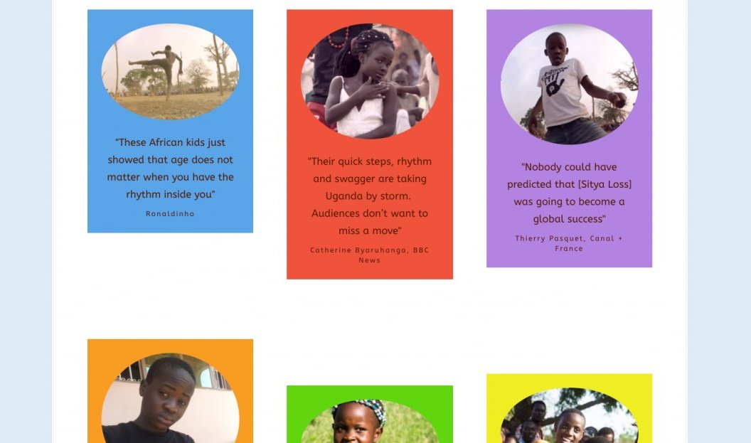
Feel free to browse the website for yourself: tripletsghettokids.com
I welcome any comments and questions and I only bite if you ask me to 😈
Share this insight
This conversation is happening inside the community.
Join free to continue it.The Internet Changed. Now It Is Time to Build Differently.
If this article resonated, the next step is learning how to apply it. Inside Wealthy Affiliate, we break this down into practical steps you can use to build a real online business.
No credit card. Instant access.