Attention Affiliates: A New Grid, A New Website, Better Conversions.
Published on February 29, 2016
Published on Wealthy Affiliate — a platform for building real online businesses with modern training and AI.
I just wanted to give all WA affiliates a quick update. As many of you are probably aware, WA is constantly evolving and improving and in the past 6 months we have put a lot of focus on improving our external WealthyAffiliate.com website...every page has been updated and improved upon.
Additionally, we have added several pages to the site as our services and offerings continue to expand (hosting, domains, websites).
You can check out the new website here if you haven’t seen it recently:
http://www.wealthyaffiliate.com
We Swapped in a New Grid Banner
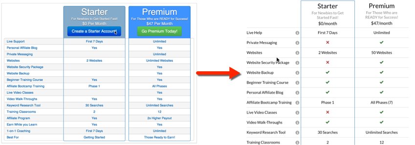
For those of you that have been using the comparison grid on your website that compares Starter vs. Premium in a nice grid. The problem though is this banner was getting quite outdated as we have added lots of new features/services to WA since this was originally created.
One thing that we really focused on is the Starter vs. Premium comparison within the new join page on WealthyAffiliate.com.
http://www.wealthyaffiliate.com/join
Out with the old and in with the new. If you were not linking to this old grid on your website, you will automatically see the new banner. If you uploaded the image directly to your site, you will want to go and grab the new banner and add it to your website.
The old grid is on the left, the new one is on the right (in the image below).

Ready to put this into action?
Start your free journey today — no credit card required.
The /join page on Wealthy Affiliate is actually one of the best converting pages (from Starter to Premium) on Wealthy Affiliate and one reason for this is the fact that people have a good idea of what they are getting before they join. They also have a good understanding that, yes, there is a Premium membership as well albeit optional.
If you want to leverage this page within your WA review or within any of your WA promotions, you can do so using the following format:
http://www.wealthyaffiliate.com/join?a_aid=YOURID
Adding the New Grid to Your Website
If you are already linking to the old grid, you should see the new upgraded grid automatically on your website. The new grid was swapped in and it will automatically replace the old one.
If you manually inserted a grid, then you can head over and get the brand new one from the banners page (the 2nd image down).
https://my.wealthyaffiliate.com/banners
It is very easy to use and you will be able to copy and paste the code directly into the "text" tab of your editor to add this new grid to your site, or you can download the grid to your computer and upload it and use it wherever you like.
You Can Link to Any Page on the New Website
Did you know that as an affiliate you can link to any page within the WealthyAffiliate.com website through your affiliate link.
Here is the format of your link, say as an example you had a post about the benefits of quality Wordpress hosting and you wanted to link directly to the “hosting” page on WA to show people the benfits.
Your affiliate link would look like this:
http://www.wealthyaffiliate.com/hosting?a_aid=YOURID
Replace YOURID with your affiliate ID. Here are some of the other more popular pages.
- http://www.wealthyaffiliate.com/education?a_aid=YOURID
- http://www.wealthyaffiliate.com/websites?a_aid=YOURID
- http://www.wealthyaffiliate.com/domains?a_aid=YOURID
- http://www.wealthyaffiliate.com/success?a_aid=YOURID
- http://www.wealthyaffiliate.com/community?a_aid=YOURID
- http://www.wealthyaffiliate.com/about?a_aid=YOURID
- http://www.wealthyaffiliate.com/join?a_aid=YOURID
You can link to any page using your affiliate link and get full credit for it. Remember, relevance converts so based on the context of the content or the conversation you are having on your website, it can be powerful to leverage the different pages on the WA.com website.
If you have any questions about the new grid, the banner system, affiliate links, or the new website, please leave them below and I will be happy to help you out.
Share this insight
This conversation is happening inside the community.
Join free to continue it.The Internet Changed. Now It Is Time to Build Differently.
If this article resonated, the next step is learning how to apply it. Inside Wealthy Affiliate, we break this down into practical steps you can use to build a real online business.
No credit card. Instant access.