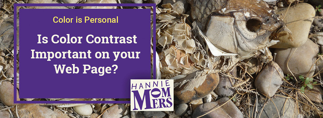
Is Color Contrast Important on your Web Page?


Published on December 21, 2020
Published on Wealthy Affiliate — a platform for building real online businesses with modern training and AI.

Years ago - while we were having a drink on a cafe terrace - a friend complained that she was stared at annoyingly and got funny remarks on her way to our appointment. She never had such an experience before.
I had no idea what caused this change of behavior until she said goodbye and walked away. A few feet away from me it looked as if she wasn't wearing a shirt. The fabric could be seen up close, but from a distance the color of her skin and the T-shirt were almost the same.
No wonder she was stared at. This was a typical example of sparse color contrast going wrong.
Color on screens
I was reminded of that story when someone asked me to check out his website. What struck me was the lack of color contrast between the different elements on the pages. In addition, colors were used right next to each other (red and green) that a color-blind person could not distinguish from each other.
It turned out that a comment about that had already come from a color blind. Making me wonder why he hadn’t changed anything.
Since 1 in 20 men is color blind, it seems to me that you should take that into account. (We women are lucky, color blindness is less common with us).

Tip: look through your eyelashes
If you make your own website and you have doubts about the color combination, take a look at your screen through your eyelashes with squinted eyes. You will see where a lot of color contrast exists and where there is little or too little.
Below is a color combination that I could have applied in my own website and what that page would look like when I look with my eyes squinted:
(PS I made the images a while ago in the Netherlands and since it’s the image that counts and not the text I left it that way.)
Ready to put this into action?
Start your free journey today — no credit card required.


Even without squinting you can see all the problems in the menu bar. And the name in pink on blue definitely causes difficulty seeing it right.
It can even get worse if you use complementary colors (complementary are colors that are opposite each other in the color circle, for example red-green or orange-blue) although it is in reality the hue of the color not the fact that they are complementary. Purple-yellow is a complementary pair of colors that can be applied without causing trouble, because it is a dark hue next to a light one.

But I love bright colors
"But those bright colors go so well with my product", I hear you say. My answer: "That's no problem, just make sure they are not right next to each other". You can also apply the colors separately.
Even then keep paying attention to the contrast between the surrounding color and the color you want to use. When you look with squinted eyes at the example below you will notice that there is not enough contrast between black and pink.

If the tip to look through your eyelashes is a problem for you, it might help you to imagine what a page looks like in black and white. The example in black and white shows this:

Color contrast in a diagram
This diagram shows that colors that are in the horizontal direction next to each other generally result in (too) little contrast. It is better to combine a color from the top rows with a color from the bottom rows.

Do you think it is important to consider the colors you choose?
Related
My other article on color:
https://my.wealthyaffiliate.com/hmommers/blog/color-is-personal-the-symbolic-meaning-of-color
Share this insight
This conversation is happening inside the community.
Join free to continue it.The Internet Changed. Now It Is Time to Build Differently.
If this article resonated, the next step is learning how to apply it. Inside Wealthy Affiliate, we break this down into practical steps you can use to build a real online business.
No credit card. Instant access.