Updated theme
Published on June 23, 2015
Published on Wealthy Affiliate — a platform for building real online businesses with modern training and AI.
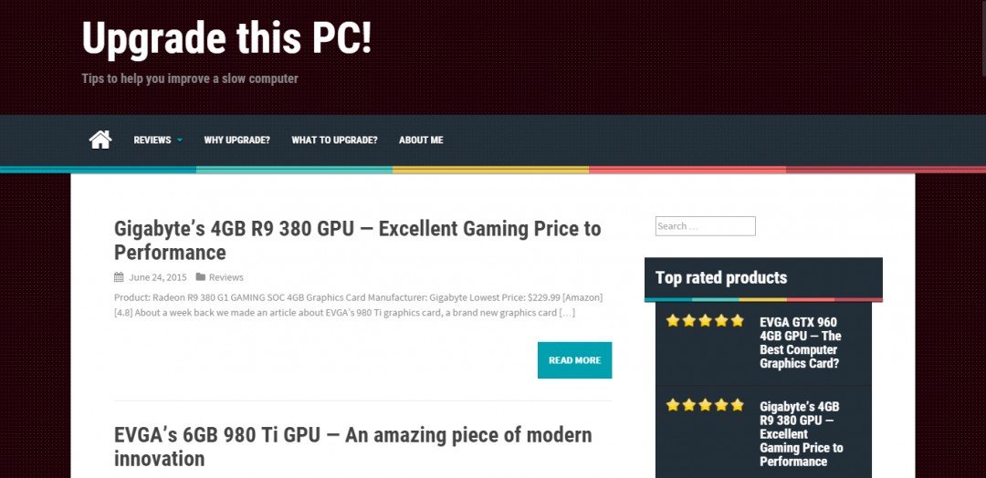
After about a month of pondering and consideration, I've finally decided to go in for the plunge and update my theme to a more exciting, more interesting one. And it wasn't actually as hard and/or time-consuming as I imagined, as I had edited the default theme and was expecting to have to fiddle around with that a lot (and I had stupidly not created a child theme). But my website changed from looking like this:

to looking like this:
Ready to put this into action?
Start your free journey today — no credit card required.

which I think looks much better.
What do you guys think of the new theme? Thanks for reading.
EDIT: I've changed the background to more of a blueish color, which I think fits well.
Share this insight
This conversation is happening inside the community.
Join free to continue it.The Internet Changed. Now It Is Time to Build Differently.
If this article resonated, the next step is learning how to apply it. Inside Wealthy Affiliate, we break this down into practical steps you can use to build a real online business.
No credit card. Instant access.