AI Image Prompting - Using Color to Control Your AI Images, Part 1


Published on August 7, 2026
Published on Wealthy Affiliate — a platform for building real online businesses with modern training and AI.

Introduction — Why Color Matters in an AI Prompt
When we create an AI image, it is easy to focus on the obvious: the subject, the setting, the lighting, the camera angle, and the composition. But there is another powerful part of the image that we shouldn't leave entirely up to AI: color.
Color does much more than make an image attractive. It can guide the viewer's eye, separate a subject from the background, create visual harmony, establish a time of day, and completely change the mood of an image.
Think about a peaceful lake at sunrise. Describe it with soft blues, misty lavender, and pale peach, and you may create a quiet, peaceful scene. Change the same scene to fiery orange, deep crimson, and dramatic black shadows, and suddenly it may feel intense or even threatening.
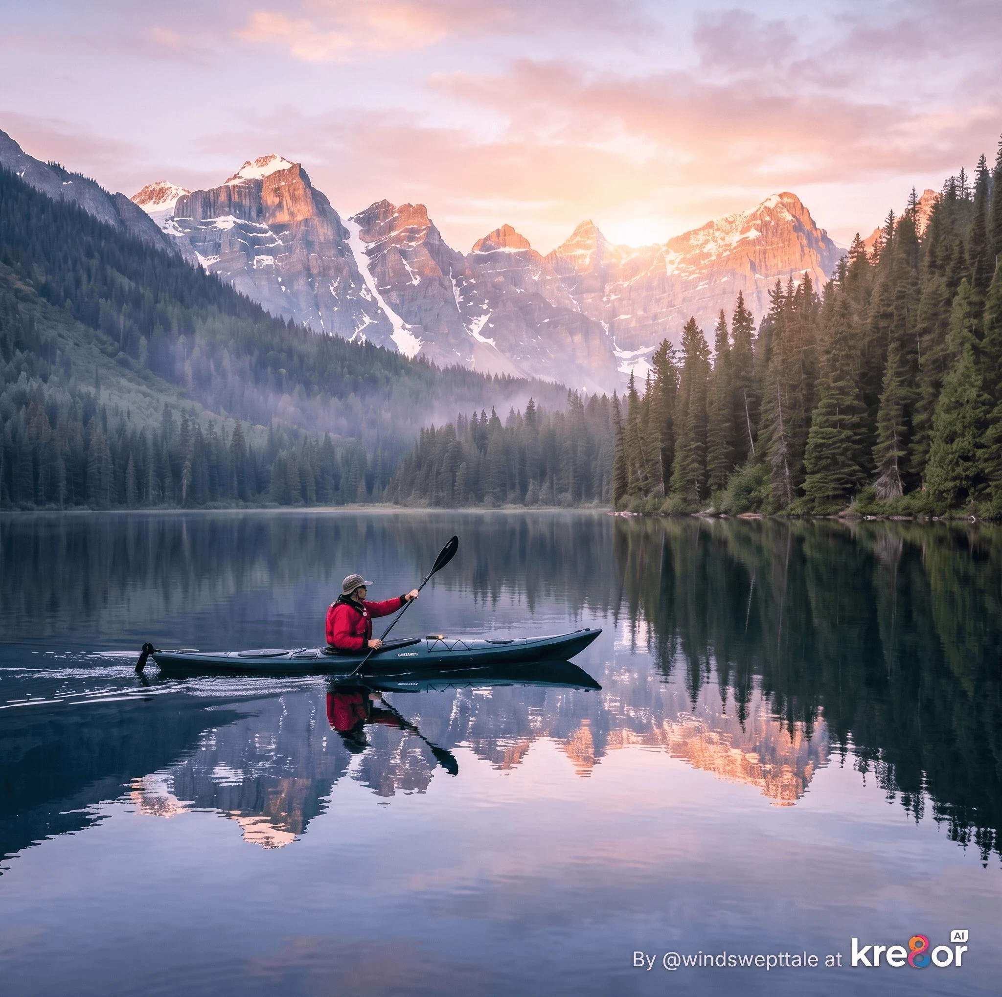 Image 1 — No Color Direction
Prompt
A lone kayaker on a peaceful mountain lake at sunrise, forested shoreline and distant mountains, realistic photography.
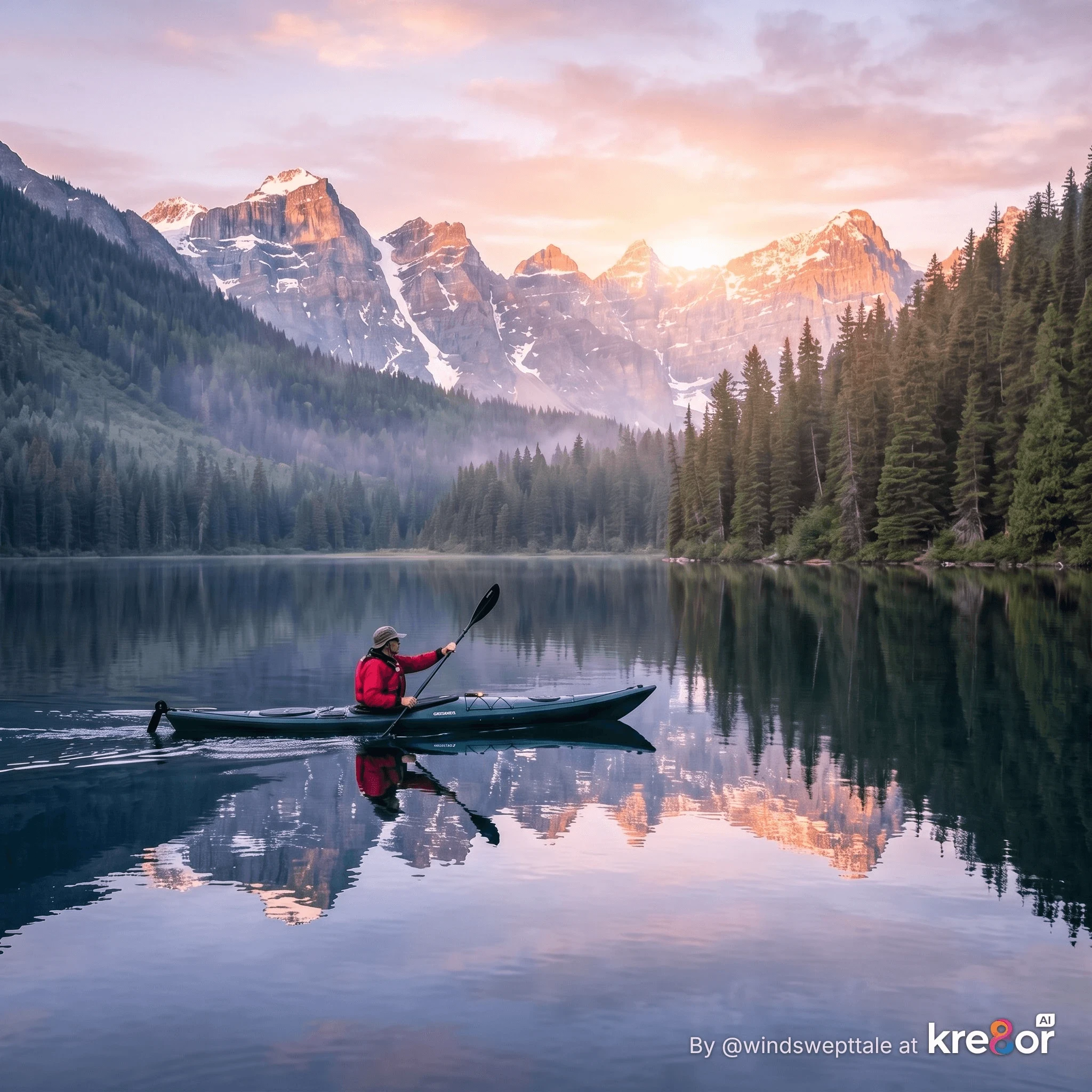 Image 2 — Soft Color Direction
Prompt
Keep the same scene, subject, and composition. Use soft blues, misty lavender, and pale peach colors with gentle morning light.
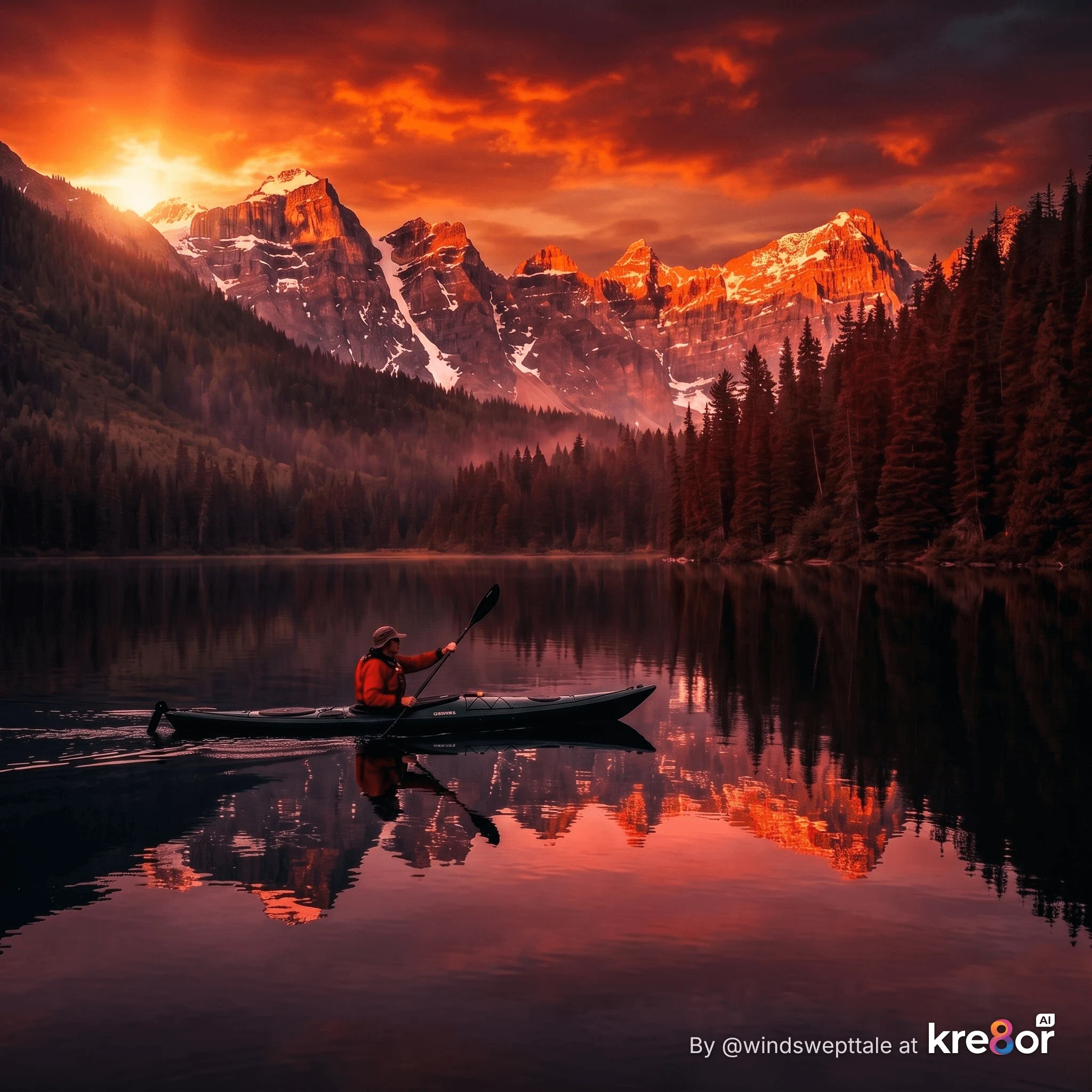 Image 3 — Dramatic Color Direction
Prompt
Keep the same scene, subject, and composition. Use fiery orange, deep crimson, and dramatic dark shadows with intense sunrise light.
The subject hasn't changed. The color has changed the experience of the image.
That's why color deserves a place in our AI prompts.
If we simply ask AI to create “a kayaker on a mountain lake,” the AI must make many of the color decisions for us.
But if we describe “a kayaker on a mountain lake surrounded by cool blue-green water, soft morning mist, muted forest greens, and touches of warm golden sunlight,” we've given the AI much more information about the image we have in mind.
And we don't need to become experts in color theory to do this.
In this first part, we'll look at some practical ways to use color in AI image prompts, including basic color relationships, better color vocabulary, palettes, saturation, color grading, and using color to direct attention.
Then, in Part 2, we'll take this one step further and explore something I find especially fascinating: how color can help us create mood, feeling, and emotion in an AI-generated image.
Because when we choose our colors deliberately, we're not simply telling AI what an image should look like.
We're beginning to tell it how we want that image to feel.
A Little Color Theory Goes a Long Way
The words color theory may sound like we're about to head into an art class, but don't worry. You don't need to memorize a color wheel to use color more effectively in an AI prompt.
What helps is understanding a few basic ways colors work together.
When you tell an AI to use a complementary, analogous, monochromatic, or triadic color palette, you're giving it more direction than simply listing a few colors. You're describing how you want those colors to relate to one another throughout the image.
Here are four useful color relationships to know:
Complementary Colors
Complementary colors sit opposite each other on the color wheel, such as blue and orange, red and green, or yellow and violet.
Because they strongly contrast with one another, complementary colors can add energy to an image and make an important subject stand out.
Try prompt wording like:
Use a complementary blue and orange color palette, with cool blue water and warm orange sunlight.
Remember the red jacket on our kayaker? A contrasting warm color surrounded by cooler colors is one reason our eye finds the kayaker so quickly.
Analogous Colors
Analogous colors sit next to each other on the color wheel, such as blue, blue-green, and green, or red, orange, and yellow.
Because the colors are closely related, they often create a more harmonious and unified appearance.
Try prompt wording like:
Use an analogous palette of blue, teal, and green throughout the lake and surrounding forest.
This can be especially useful when you want the colors in an AI image to feel as though they naturally belong together.
Monochromatic Colors
A monochromatic palette uses variations of one main color—lighter, darker, brighter, or more muted versions of it.
That doesn't necessarily mean the entire image has to look like it was dipped in blue paint! It simply means one color family dominates the image.
Try prompt wording like:
Use a monochromatic blue palette ranging from pale misty blue to deep navy shadows.
Monochromatic palettes can create a strong, unified look and are particularly useful when you want color to support a specific atmosphere without lots of competing hues.
Triadic Colors
A triadic palette uses three colors spaced roughly evenly around the color wheel, such as red, yellow, and blue.
Triadic combinations can give an image more variety and energy while still providing a planned color relationship.
Try prompt wording like:
Use a balanced triadic palette of blue, golden yellow, and touches of red.
The important word there may be balanced. Three strong colors competing equally for attention can become overwhelming. One can dominate while the others provide supporting accents.
You Don't Have to Memorize This
The goal isn't to look at every AI image and identify its color scheme.
The practical takeaway is much simpler:
Instead of always prompting:
Use beautiful colors.
or even:
Use blue and orange.
you can begin giving the AI more useful direction:
Use a complementary palette of deep blue and warm orange, with blue dominating the scene and orange used as an accent.
You're not just choosing colors anymore. You're beginning to describe how those colors should work together.
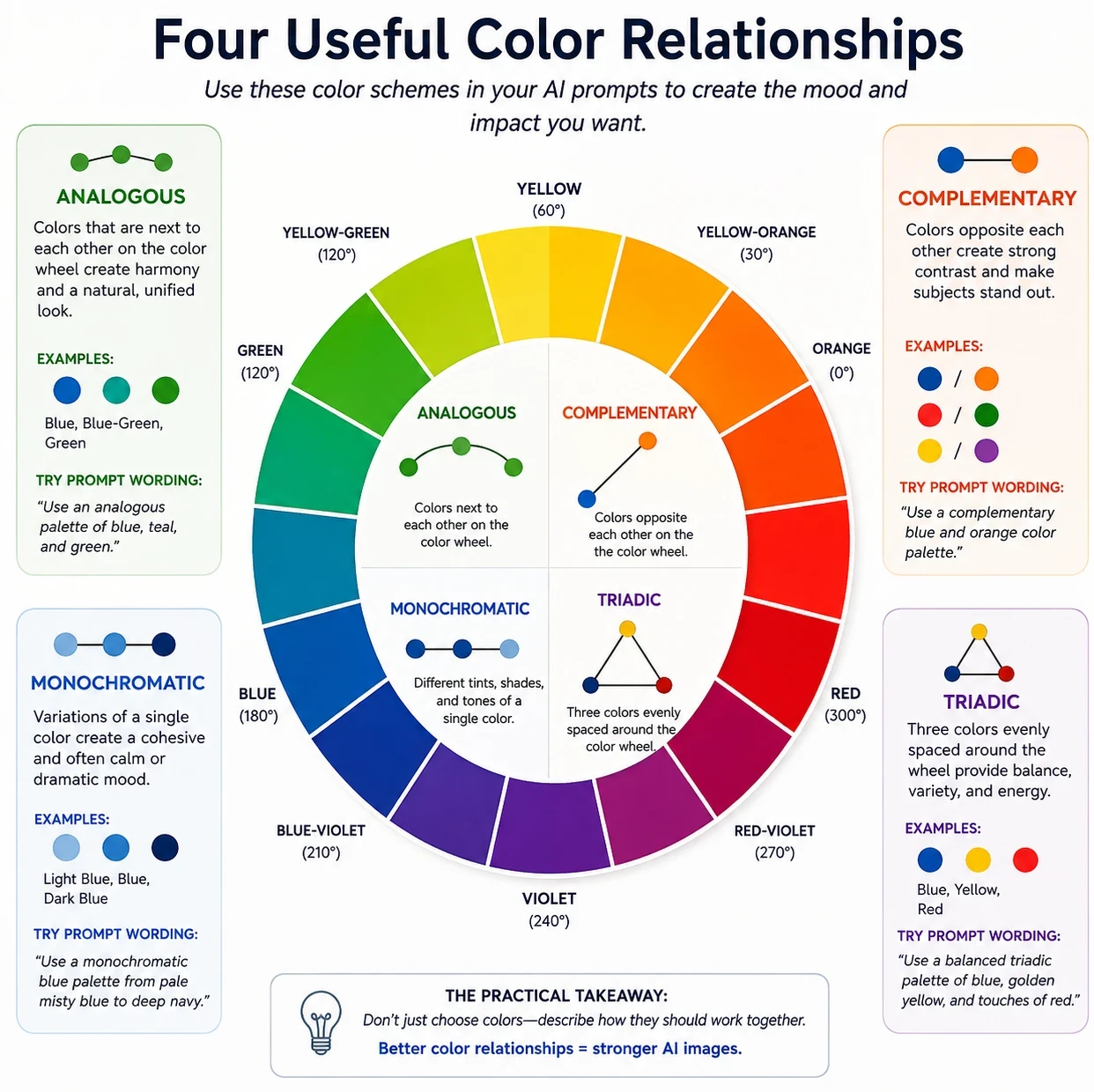 Four useful color relationships—complementary, analogous, monochromatic, and triadic—can give AI clearer direction for how colors should work together in an image.
Give AI Better Color Words
One of the easiest ways to gain more control over color in an AI image is simply to be more specific.
If you ask for blue, AI has a lot of choices to make. Do you mean a pale powder blue, brilliant turquoise-blue, rich cobalt, muted slate blue, or almost-black navy?
Compare these two prompt phrases:
Create a blue lake beneath a blue sky.
and:
Create a deep sapphire-blue lake beneath a soft powder-blue morning sky.
Both ask for blue, but the second gives AI—and us—a much clearer picture of the intended result.
Get More Specific With Color Names
You don't need to know hundreds of color names. A few descriptive alternatives can greatly expand your prompting vocabulary.
Instead of simply using:
- Red: try crimson, scarlet, burgundy, cherry red, brick red
- Orange: try amber, burnt orange, apricot, terracotta
- Yellow: try golden yellow, lemon, mustard, butter yellow
- Green: try sage, olive, emerald, moss, forest green
- Blue: try powder blue, cerulean, cobalt, sapphire, navy, slate blue
- Purple: try lavender, violet, plum, mauve, deep purple
- Pink: try blush, dusty rose, coral pink, rose pink
- Brown: try tan, caramel, chestnut, chocolate, espresso
- White: try ivory, cream, pearl white, warm white
- Black: try charcoal, soft black, jet black
Notice that many of these words do more than identify a color. Sage green suggests something quite different from emerald green. Blush pink produces a different expectation than hot pink.
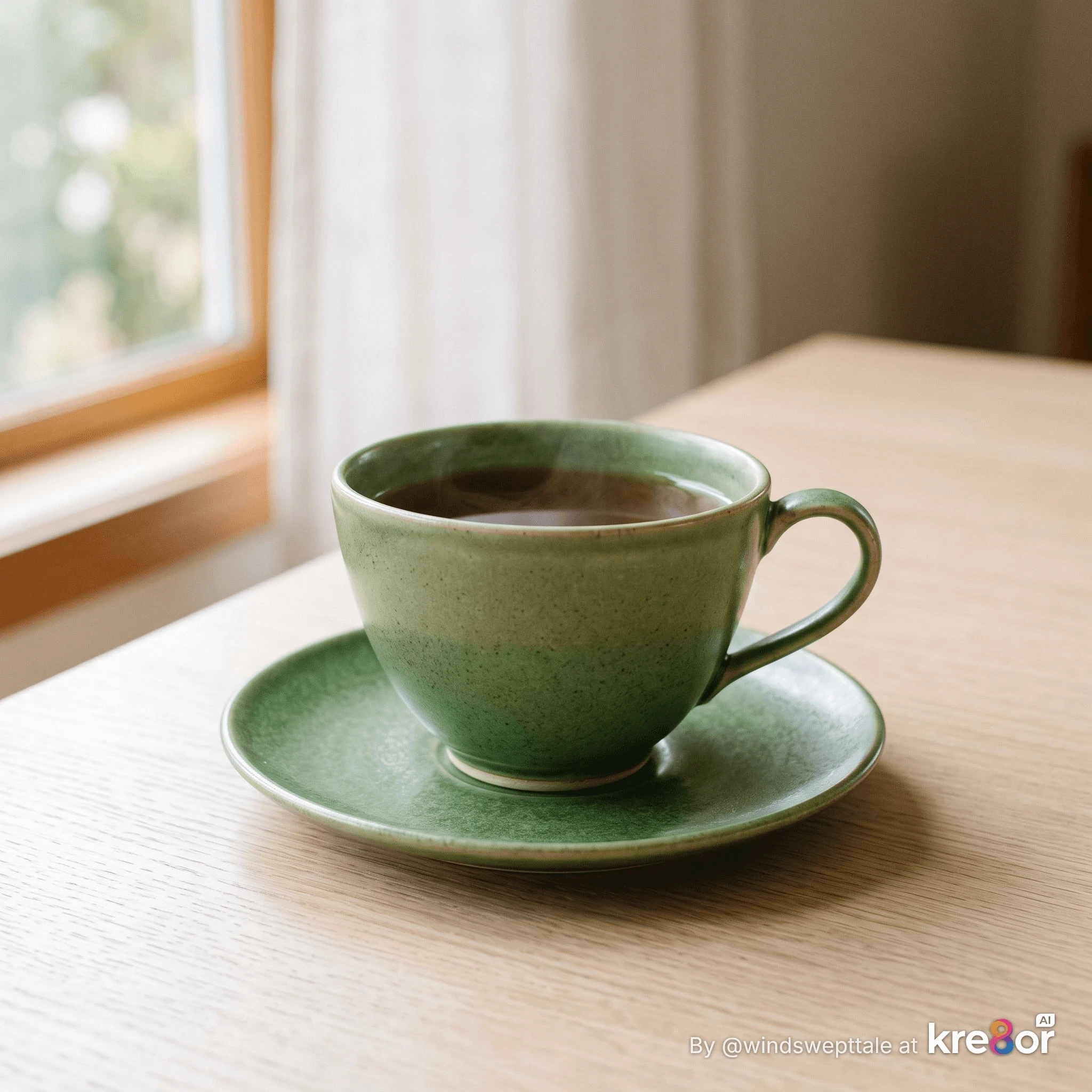 Prompt
A simple elegant ceramic teacup and saucer on a light neutral tabletop, soft natural window light, uncluttered background, realistic product photography. The teacup is green. Front three-quarter view, centered composition.
We told Kre8or only that the teacup should be green, so Kre8or decided what kind of green to use.
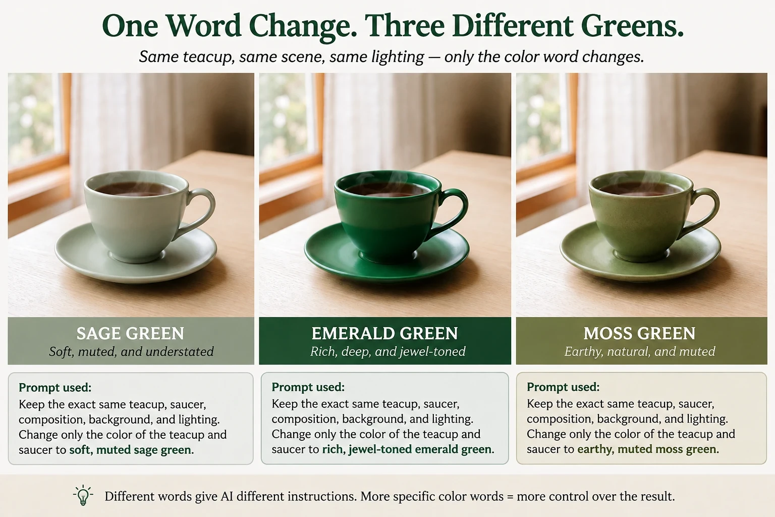 The same scene with three more specific color instructions. Notice how “sage,” “emerald,” and “moss” produce different interpretations of green.
The lesson isn't that AI will interpret every color word exactly the same way we do. The lesson is that more specific color language gives AI more information about what we're trying to create.
Warm Colors and Cool Colors
Sometimes you don't need to specify individual colors at all. You can give AI direction by describing the overall color temperature you want.
Warm colors generally include reds, oranges, and yellows. Cool colors generally include blues, greens, and violets.
Try:
Use a warm color palette of golden yellow, burnt orange, and touches of deep red.
Or:
Use a cool color palette of misty blue, sage green, and soft lavender.
But you don't have to choose one or the other. Some of the most interesting images combine warm and cool colors.
For example:
Use predominantly cool blues and greens, with small accents of warm golden orange.
Now we're telling AI more than which colors to use. We're also telling it which colors should dominate and which should act as accents.
Warm and Cool Can Work Together
Warm and cool colors can also help separate different areas of an image.
Try:
Cool blue shadows with warm golden highlights.
Or:
Place the subject in warm golden light against a cool blue-green background.
That second prompt does something particularly useful. The warm color isn't spread throughout the entire image. We're asking AI to use it selectively to help distinguish the subject from the surroundings.
This gives us another useful prompting technique: we can tell AI not only which colors to use, but where to use them.
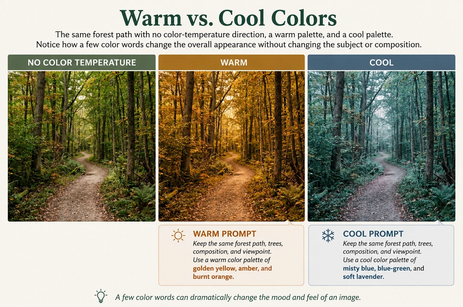 The same forest path with three different color directions. Warm and cool color words can change the overall appearance while the subject and composition remain the same.
Use Palette Words as Shortcuts
Here's another useful trick: instead of naming every color individually, use a phrase that describes an entire palette.
Ready to put this into action?
Start your free journey today — no credit card required.
Try terms such as:
Earth tones — browns, ochres, muted greens, rust, clay and tan
Jewel tones — emerald, sapphire, ruby, amethyst and other rich, saturated colors
Pastel palette — pale pink, baby blue, lavender, mint, peach
Muted palette — softened, subdued colors with less intensity
Neutral palette — cream, beige, gray, taupe, brown, black and white
Vintage palette — faded, slightly muted colors that suggest age
Autumn palette — rust, burnt orange, mustard, burgundy and earthy brown
Coastal palette — sea blue, aqua, sandy beige, white and soft gray
So instead of writing:
Make the scene pretty with natural colors.
You might prompt:
Use a muted earth-tone palette of moss green, warm ochre, weathered brown, and soft cream.
That's much more useful direction.
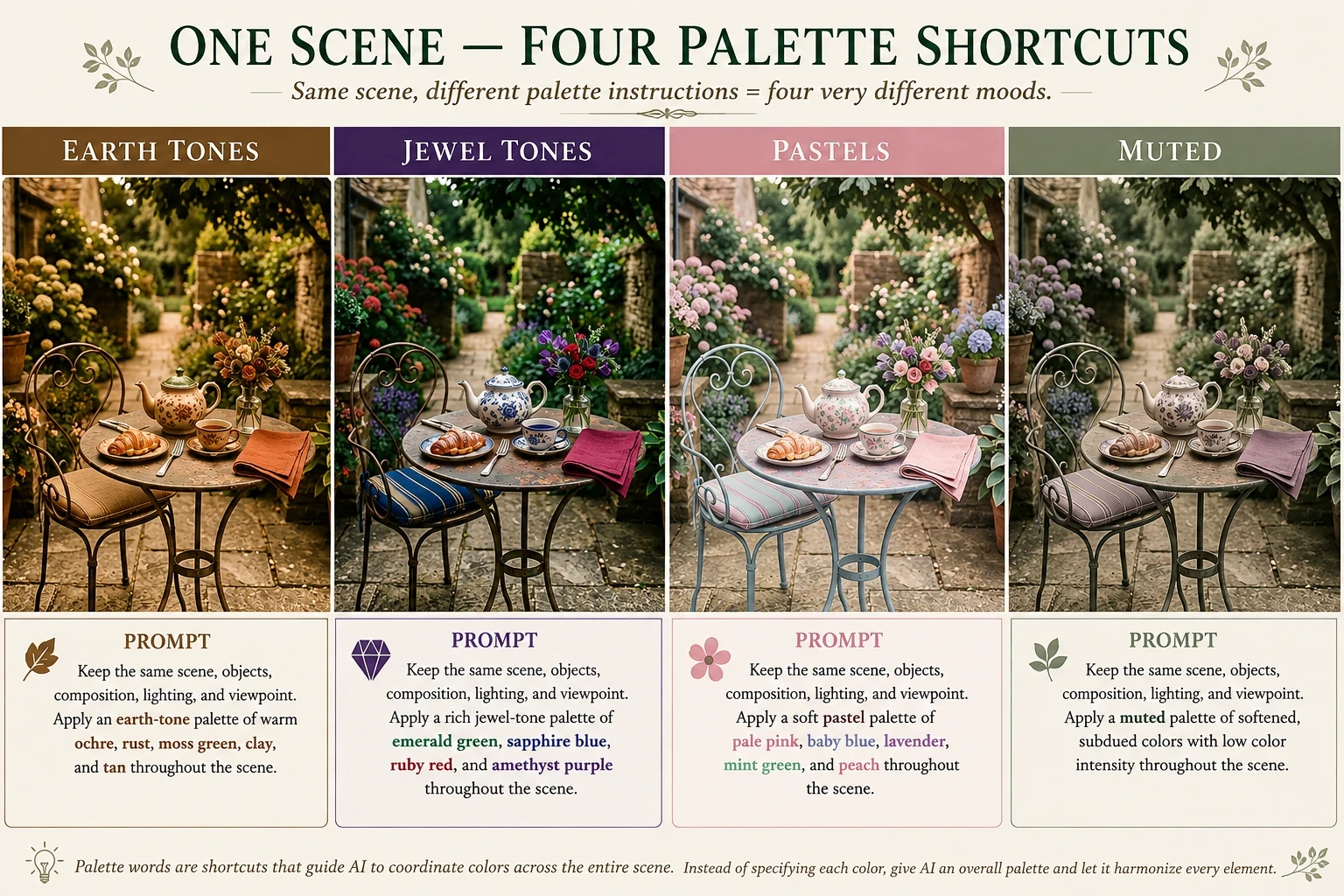 The same scene using four different palette shortcuts. A named palette can help AI coordinate colors throughout an image without specifying the color of every individual object.
Don't Just Name the Colors—Give Them Jobs
Choosing the right colors is useful, but we can take our prompts another step. Instead of simply telling AI which colors to include, we can tell it how those colors should be used in the image.
For example, instead of:
Use navy blue and gold.
Try:
Use deep navy blue as the dominant color, with small touches of warm gold highlighting the main subject.
Now we've given AI three pieces of information:
What colors to use, which color should dominate, and where the accent color should appear. That's much closer to directing an image than simply requesting colors.
Give Colors a Purpose
There are several useful “jobs” we can give colors in a prompt.
Dominant color — the main color that establishes the overall look.
Use deep forest green as the dominant color throughout the scene.
Accent color — a smaller amount of contrasting color used to attract attention.
Add small accents of warm golden yellow around the main subject.
Background color — helps establish separation between the subject and its surroundings.
Place the pale cream teacup against a deep blue-green background.
Highlight color — draws attention to particular details or areas.
Use warm amber highlights along the edges of the subject.
Shadow color — gives us more control than simply asking for dark shadows.
Use cool blue-violet tones in the shadows.
Tell AI Where the Color Belongs
Location words can make color instructions even more useful.
Instead of:
Use red, gold, and blue.
Try:
Use deep blue throughout the background, warm gold on the main subject, and small red accents in the foreground.
We're no longer handing AI a list of colors and hoping it decides where they belong. We're assigning the colors a job and a location.
And this is also where color starts becoming part of composition. A carefully placed accent color can help draw the viewer's eye toward the most important part of an image.
Saturation Changes the Look
Another useful way to control color in an AI image is through saturation.
Saturation describes the intensity or purity of a color. Highly saturated colors appear strong, vivid, and intense. Lower-saturation colors appear softer, quieter, or more subdued.
You don't need to understand the technical science behind saturation to use it in an AI prompt. A few descriptive words can give the AI useful direction.
For stronger color, try words such as:
saturated, vibrant, vivid, rich, intense, bold
For softer color, try:
desaturated, muted, subdued, faded, washed-out, soft
Compare a Lake Scene
Instead of:
Create a quiet lake scene with a red rowboat beside an old wooden dock.
Try adding saturation direction:
Create a quiet lake scene with a red rowboat beside an old wooden dock, using highly saturated, vibrant colors with vivid reds, rich greens, strong yellows, and intense blues.
Or:
Create the same lake scene using a desaturated, muted color palette with softened reds, dusty greens, restrained yellows and purples, and subdued blues.
The subject and composition haven't changed. We're asking AI to change the intensity of the colors.
What Happened When I Tried This in Kre8or?
This experiment also taught me something useful about prompting.
I first created the lake scene without giving Kre8or any saturation instructions:
“A small red wooden rowboat tied to an old weathered wooden dock on a quiet lake, wildflowers growing naturally along the shoreline, wooded hills reflected in the calm water, soft natural daylight, realistic photography, eye-level view, balanced composition.”
That became my natural-color control image.
I then asked Kre8or to keep the scene unchanged while strongly desaturating the colors. The result changed—but only slightly. Even after strengthening the prompt with words such as strongly desaturate, muted, subdued, and reduce color intensity significantly, Kre8or's interpretation remained fairly subtle.
That's an important prompting lesson:
AI interprets descriptive color words. It doesn't treat them like exact adjustment sliders.
To make the difference easier to see in the comparison below, I used the original Kre8or image in Photoshop and created a -55 saturation version and a strongly saturated version. The natural image in the center is the original Kre8or result.
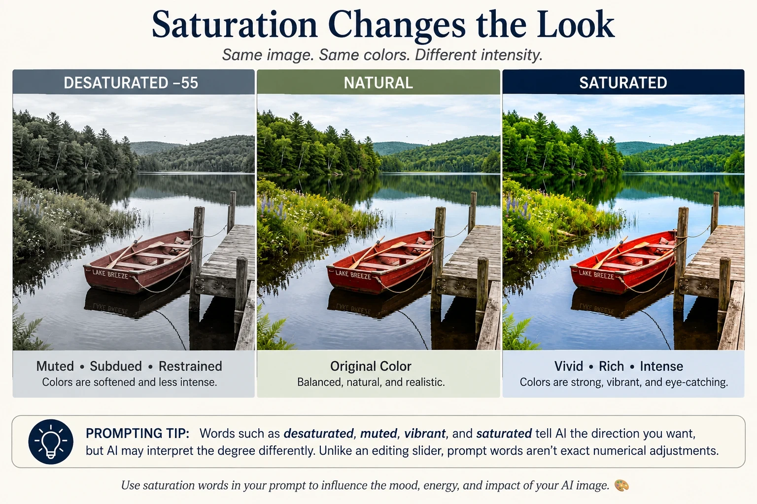 Notice that the scene itself hasn't changed. The boat, dock, lake, flowers, trees, lighting, and composition remain the same. Only the intensity of the color changes—and yet each version has a noticeably different visual impact.
Saturation Doesn't Mean Brightness
This is worth remembering: saturation and brightness aren't exactly the same thing.
A color can be dark and highly saturated, such as a deep, intense ruby red. A color can also be light and saturated, such as a vivid turquoise.
For AI prompting, we don't need to get overly technical. The important thing is knowing that words such as vibrant and saturated generally ask for stronger color, while muted and desaturated ask AI to reduce the color intensity.
Color Grading — Another Powerful Prompt Tool
Color grading is another way to influence the overall look of an AI-generated image.
Instead of simply telling AI which colors should appear in the scene, color grading describes how the colors of the entire image should be treated.
You may already recognize this idea from movies and photography. Color grading can make a scene feel warmer, cooler, more cinematic, nostalgic, dramatic, or stylized.
For AI prompting, we don't need to understand all the technical details. We just need some useful language.
Warm Highlights and Cool Shadows
One particularly effective combination is warm highlights with cool shadows.
Try:
Use warm golden highlights and cool blue shadows to create depth and visual contrast.
Or be more specific:
Illuminate the subject with warm amber highlights while keeping the shaded areas in cool blue tones.
Notice that we're giving different parts of the light different color treatments.
Teal and Orange
You may also encounter the phrase teal-and-orange color grading.
This combination is frequently associated with a cinematic look because warm orange tones and cooler blue-green tones create strong color contrast.
Try:
Use subtle teal-and-orange cinematic color grading, with warm highlights and cooler teal shadows.
The word subtle can be important. Without it, AI may exaggerate the effect.
An Interesting Thing Happened When I Tried This (Once Again)
I created a street scene without specifying color grading. Kre8or naturally gave the blue-hour scene cool blue tones while the shop windows and streetlights glowed with warm amber light.
I then asked Kre8or to apply subtle teal-and-orange cinematic color grading while keeping the scene unchanged.
The result?
Very little changed.
In this case, the original image already contained much of the color relationship I was asking for. Cool blues dominated the sky and shadows, while warm amber and orange appeared in the illuminated areas.
This is another useful lesson:
AI may already introduce color relationships associated with a particular photographic or cinematic look, even when we don't specifically request them.
Color-grading terminology can help guide an image, but it doesn't guarantee a dramatic transformation—especially when the existing image already contains those color relationships.
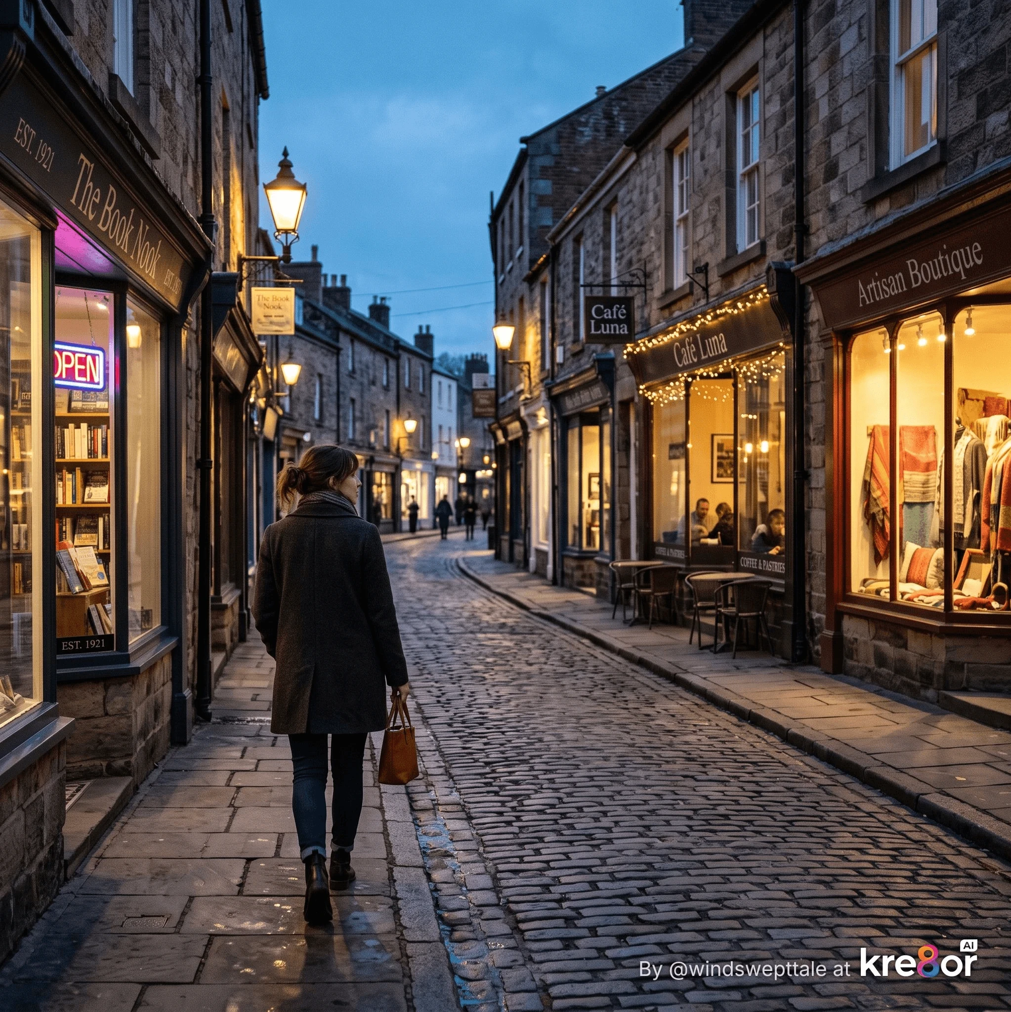 Even without a color-grading instruction, Kre8or naturally created a warm-and-cool relationship: amber shop lights against the cool blue tones of evening.
Cinematic and Film-Inspired Color
You can also use broader color-grading language in a prompt:
- cinematic color grading
- film-inspired color palette
- warm cinematic tones
- cool cinematic grading
- soft vintage film colors
- moody cinematic color treatment
These phrases don't give AI exact color instructions. Instead, they give it a visual direction.
And just as we discovered with saturation, AI may interpret these terms differently from one generation to another.
Color Grading Is About the Overall Look
Here's an easy way to remember the difference:
Color choice: Use deep blue and warm gold.
Color placement: Use deep blue in the background and warm gold on the subject.
Color grading: Give the entire image warm golden highlights and cool blue shadows.
Each gives AI a different kind of information—and you can combine all three in the same prompt.
Use Color to Guide the Viewer's Eye
Color doesn't just affect how an image looks. It can also help determine where the viewer looks first.
Our eyes are naturally attracted to areas that are different from their surroundings. A small area of warm, bright, or strongly contrasting color can become a focal point—especially when the rest of the image is quieter or more subdued.
This makes color another useful composition tool.
Think about a person wearing a bright red coat in a misty gray forest. Even if the person occupies only a small part of the image, your eye will probably find that red coat immediately.
Or imagine a mostly cool blue lake scene with a single warm golden light glowing from a cabin window. That small area of warm color can pull your attention across the entire image.
Tell AI What Should Stand Out
Instead of simply prompting:
Create a woman walking through a misty forest.
We can give color a compositional purpose:
Create a woman in a bright red coat walking through a misty forest of muted gray-green trees. Keep the surrounding colors soft and subdued so the red coat becomes the primary focal point.
We're doing more than choosing colors. We're telling AI which color should attract attention and which colors should support it.
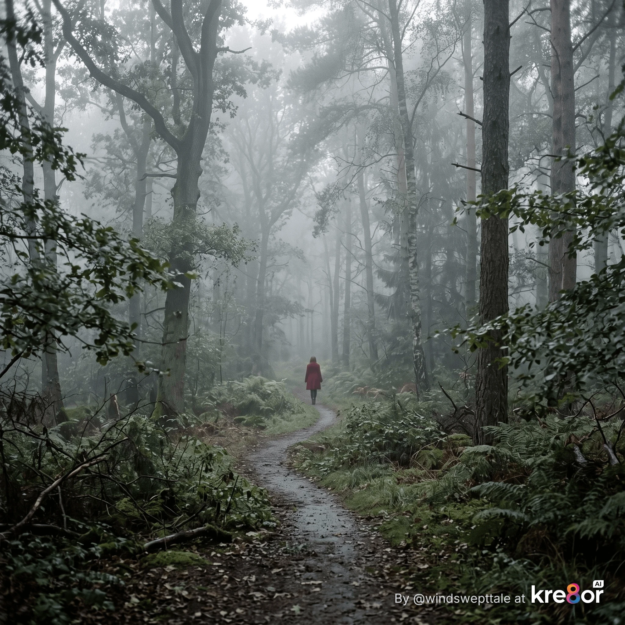 The woman occupies only a tiny part of the image, yet the red coat immediately attracts attention. Muted surrounding colors and the winding path work together to guide the viewer's eye toward the focal point.
Prompt
Realistic fine-art photograph of a quiet misty forest in early morning. A winding woodland path begins in the foreground and leads deep into the scene. Tall trees and soft fog surround the path. Farther down the path, place a solitary woman walking away from the camera wearing a vivid deep-red coat.
Use a predominantly muted, desaturated palette of soft gray-green, moss, charcoal, and misty gray throughout the forest. Keep the trees, path, fog, and background subdued and low in color intensity.
Reserve the strongest and most saturated color in the entire image for the woman's red coat. The red coat should become the clear visual focal point without making the woman large in the composition.
Use the winding path as a subtle leading line toward her. Soft diffused morning light, atmospheric depth, realistic photography, natural forest textures, vertical composition.
Other Useful Prompt Phrases
- Use a single warm color accent to draw attention to the main subject.
- Keep the background colors muted so the subject stands out.
- Use contrasting color around the focal point.
- Reserve the brightest color for the most important element in the scene.
- Use small touches of warm gold to guide the viewer's eye toward the subject.
Color and Composition Work Together
This connects directly with the composition techniques we explored earlier in this series.
Leading lines, framing, placement, light, and depth can guide the viewer's eye—but color can reinforce all of them.
A path might lead toward your subject, for example, while a carefully placed contrasting color makes that subject even easier to find.
The important prompting idea is simple:
Don't just decide what colors should be in your image. Decide where you want the viewer to look—and use color to help take them there.
A Final Thought
Color in an AI prompt is much more than saying red, blue, or green.
As we've seen, we can tell AI which colors to use, how intense those colors should be, where they should appear, which colors should dominate, and even which colors should attract the viewer's attention.
But perhaps the most useful lesson from these experiments is this:
Color words give AI direction—not absolute instructions.
We saw that firsthand. Kre8or didn't always interpret words such as desaturated or teal-and-orange color grading exactly as we expected. Sometimes the change was subtle. Sometimes the original image already contained much of the color relationship we were asking for.
That's part of learning to work with AI image generators.
The goal isn't necessarily to control every pixel. It's to give the AI enough useful direction that the resulting image moves closer to what you imagined.
And the more specific our color language becomes, the better our chances of getting there.
Coming Next: Color, Mood and Emotion
So far, we've concentrated mostly on how to control color.
In Part 2, we're going to explore something I find even more fascinating:
How does color make an image feel?
We'll look at how color choices can help create moods such as:
- peaceful and serene
- joyful and energetic
- mysterious
- melancholy
- romantic
- nostalgic
- dramatic
- ominous
We'll also experiment with how changing the color palette can change the emotional story of an image—even when the subject and composition stay essentially the same.
Because ultimately, choosing color isn't only about making an AI image look beautiful.
It's about helping the viewer feel something.
-Shirley
TIPS:
Many of the images and examples you’ll see throughout the series are created using Kre8or.ai, the AI image creation tool available here at Wealthy Affiliate. If you’d like to experiment with your own AI images, you can try Kre8or here: you can try out Kre8or.ai now for FREE: https://kre8or.ai Check out my profilfe there under my handle "windswepttale".
Comments
I enjoy receiving questions and comments from site visitors, you can leave yours below. - Shirley
Share this insight
This conversation is happening inside the community.
Join free to continue it.The Internet Changed. Now It Is Time to Build Differently.
If this article resonated, the next step is learning how to apply it. Inside Wealthy Affiliate, we break this down into practical steps you can use to build a real online business.
No credit card. Instant access.