Some Feedback for my Site's New Logo!
Hey everyone, hope you're all having a great weekend.
I took this day to create, what I believe to be, a simple yet decent looking Logo for my website. Here's a picture of my final design.
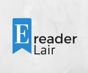
If you have the time, please give me some honest feedback (weather good or bad) on how it looks. *fingers crossed
Oh, and if you DO like it, but don't wanna leave your feedback, let me know with the Green button below :)
Thanks in advance,
Luis
Recent Comments
24
Hi. I like it, and I see what you are going for with e-reader lair. A safe haven for people who love to read. But I think what you need is a silhouette picture in the background that illustrates that philosophy. Perhaps you could have a shadow of someone laying on top of the word reader holding up a book and reading it. Just some ideas
Hi Steph,
I left that space to add something in the future, but yours is an amazing idea. Really love it! Now I only have to figure out how to do it lol.
Thanks a bunch
Yeah I like it. Simple. I too think you need a little catch phrase of some sort on the bottom part. But perhaps you have that already on your site.
Excellent work I need to do the same
Hi Michael,
Thanks for your feedback. Sorry, I don't quite understand what you are asking. Are you asking why I used "lair"?
I'd make the letter e a bit smaller.
What is meant by the word lair???
I don't think its a word people associate with e reading...
But then again I'm no expert on your niche, perhaps it is.
What about a tagline also to go underneath it, ex.
"For the best e reading experience!"
That's my thoughts but then again I'm no expert in your niche
Hi Paul, thank you very much for taking some of your time to leave a feedback. I'll see what I can do with the E, thanks for this.
As for "lair", I thought the best way to explain is by giving you its definition:
lair: a secret or private place in which a person seeks concealment or seclusion.
synonyms: hideout, hiding place, hideaway, refuge, sanctuary, haven, shelter, retreat
So my "goal" with this word is to make people feel like it's a safe place for groups of readers. It's really more symbolic than anything lol. Hope this clears it up.
I'll also consider adding my tagline
Thanks
See more comments
Nice clean lines Luis, well done.