WordPress 3.8 - The Best Redesign Since Ever?
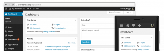
If you've logged into your WordPress dashboard today, you may have noticed that there is a new WordPress 3.8 update available. If you've not yet updated your site, I suggest you go do it now.
In my opinion, this is the best redesign since ever .
This update is named “Parker” in honor of Charlie Parker and introduces a modern new design with a whole lot of new features. Check out the all new WordPress 3.8 "Parker".
http://wordpress.org/news/2013/12/parker/

Is WordPress 3.8 "Parker" the most beautiful WordPress yet? Please let us know your opinion.
Join FREE & Launch Your Business!
Exclusive Bonus - Offer Ends at Midnight Today
00
Hours
:
00
Minutes
:
00
Seconds
2,000 AI Credits Worth $10 USD
Build a Logo + Website That Attracts Customers
400 Credits
Discover Hot Niches with AI Market Research
100 Credits
Create SEO Content That Ranks & Converts
800 Credits
Find Affiliate Offers Up to $500/Sale
10 Credits
Access a Community of 2.9M+ Members
Recent Comments
5
I always recommend that Members have a full backup before updating, https://my.wealthyaffiliate.com/training/backup-wordpress-to-dropbox-tutorial and they check the changelogs of their themes and plugins to ensure compatibility or test on a dummy siterubix site. I prefer to wait for the #.#.1 update, which will incorporate any bug fixes. There's nothing worse than hitting the update button only to discover you've ended up with a non-working site, especially if it's your primary earner. :) Rich.
Thanks Rich. I've updated my site and it seems to be working fine. Since it's the first version of WordPress 3.8, it's a good idea to backup before updating.
Hi Jeffrey - I like the dark design, and also that you can change it to a range of colour schemes now (think it was only 2 before).
I like the new font - much nicer on the eye - and I know they have made changes to the widgets, and general accessibility - which is very good.
The new 2014 theme though - I'm not sure about that yet - all the "stuff" that we've usually seen on the right (recent posts, tags etc), are now all on the left and in black!
Maybe it's just something to get used to - good to know what everyone else thinks - recommendations here are dark text on a light background...
All the best, Mark
Thanks Mark for sharing your opinions. I like the dark design and new font that make the dashboard looks neat and comfortable.
See more comments
Join FREE & Launch Your Business!
Exclusive Bonus - Offer Ends at Midnight Today
00
Hours
:
00
Minutes
:
00
Seconds
2,000 AI Credits Worth $10 USD
Build a Logo + Website That Attracts Customers
400 Credits
Discover Hot Niches with AI Market Research
100 Credits
Create SEO Content That Ranks & Converts
800 Credits
Find Affiliate Offers Up to $500/Sale
10 Credits
Access a Community of 2.9M+ Members
So far I've only updated a test site like Rich says. I still need to really spend the time and go in and check it all out. Not sure about the dark back drop to everything yet. And I haven't even taken the time to look at the 2014 yet. So much to do.... ya know?