

When it comes to website design, the user is the key focus with all of our activities. If they have a good experience, then they are going to stick around on your website engaging in your content, trust you at a much higher rate, and as a result, allow you to monetize your traffic at a much higher rate (that is, the ultimate goal).
Tasks for this Lesson:
- Understanding User Centric Design
- Importance of a mobile-friendly design
- Basic design elements every site needs
- Creating the Structure of your first menu
The design, organizational structure, and layout — these are the components we are going to touch on in this lesson.
Your Website Design (Your Theme)
The first being the broader website design, which is controlled by the “design” of your website, which is also known as your theme in Wordpress.
Simplicity, believe it or not, is the golden rule of design. An intuitive, clutter-free design, without all the confusing bells and whistles is one that will lead to the best design.
No one loves to play treasure hunt while looking for information. So keep it simple, keep it neat, and avoid website themes that can create this confusion. With ALL websites installed here at Wealthy Affiliate, the default is GeneratePress, but there are over 4,000 different themes that you can choose from as a Premium/Premium Plus+ members. So you can change your theme at any point.
Your Navigational Structure (Custom Menus)
In the digital landscape, a website's navigation truly is its backbone. Think of it as a roadmap guiding your visitors' exploration. Not only does it enable accessibility to different parts of your website, but it also significantly impacts your overall user experience, and indirectly, your SEO ranking.
This holds especially true when working with website management systems like WordPress (which your website is built on) where structured navigation can either elevate or plummet the functionality of your site. It's more than just placing items into a menu; it forms the essence of a user's encounter with your website, influencing your bounce rate, dwell time, and even conversions.
Within the Hubs platform, you are going to get a good idea as to the direction your navigation can head through time, within the Websites & Structure section of your Hub.
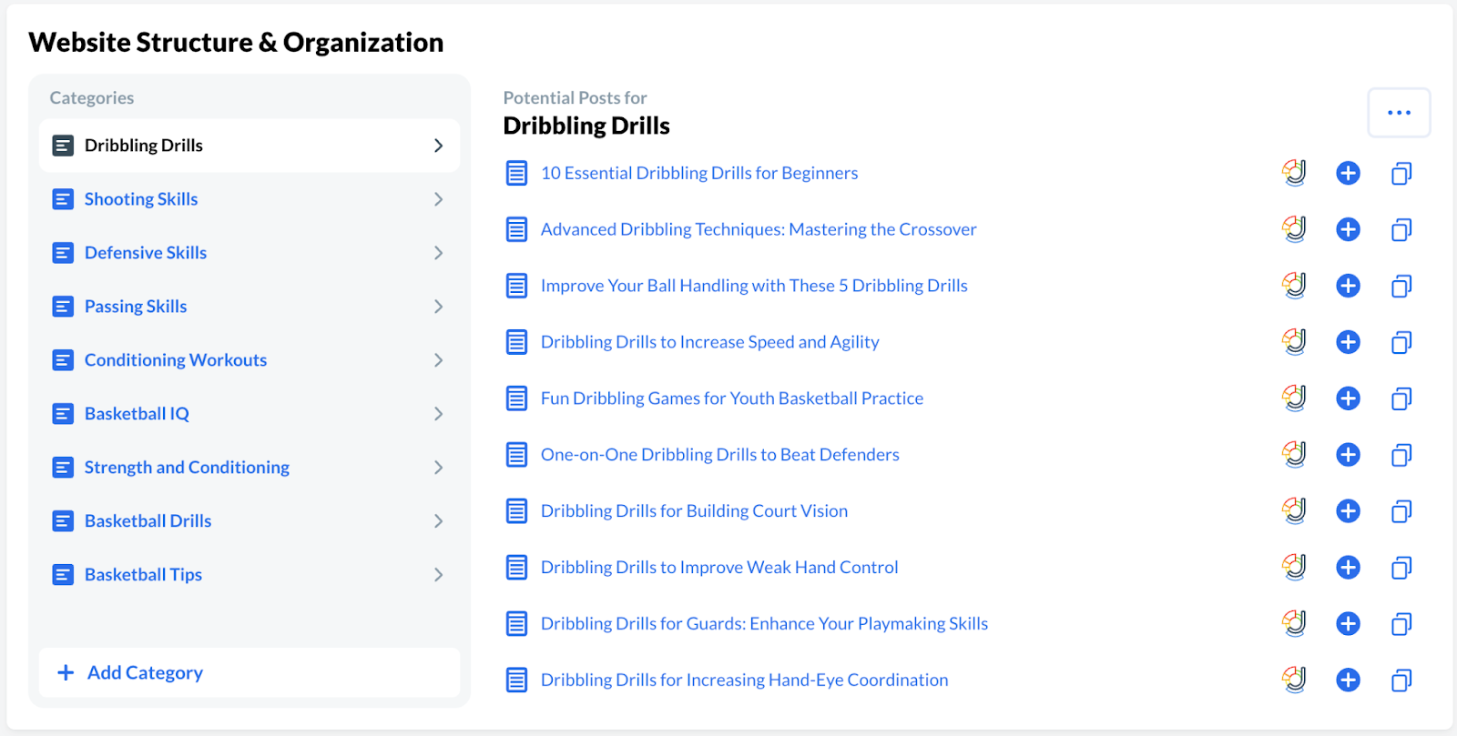
On the left, you will see “Categories”. These are high level examples of potential top level menus, and then within the “Potential Posts” for that section on the right, you will get some ideas of post that you may want to nest under that menu.
To create a solid navigational structure in WordPress, you need to understand the key elements of a menu. WordPress organizes its menus into five components: Pages, Posts, Custom Links, Categories, and Tags.
- Pages serve as the main content areas of your website - like 'About Us' or 'Contact'.
- Posts are dynamic elements often used for blogs or news updates.
- Custom Links allow you to link to external websites or files.
- Categories and Tags classify your content, making it easy for users to locate specific topics.
Creating a core navigational structure in WordPress involves several steps. Start at the WordPress dashboard, proceed to Appearance and then 'Menus'. After naming your menu, you can add desired Pages, Links or Categories, and adjust their hierarchical order by simply dragging and dropping the items (as outlined in the video)
Remember, the way you structure your menu should reflect the way you want your users to navigate your website.
Crafting a user-friendly menu involves a thoughtful approach. Consider the hierarchy of your pages, ensure logical organization, and always use clear labels. Avoid bombarding users with too many options, a common mistake that leads to decision paralysis.
While getting your navigation structure up and running is a significant feat, remember that your work doesn't stop there. SEO optimization and Google E-E-A-T compliance also play a crucial role in the functionality and success of your navigational structure. Design your menus in a way that balances user friendliness with search engine visibility. Updating and revising your menu should be an ongoing process as your site evolves and grows. After all, a website is a living entity, and navigation serves as its ever-evolving pathway.
The Layout (Widgets).
What about the rest of your website layout and design? How is that managed? Introducing Wordpress “widgets”.
Though this lesson is not going to be about managing your widgets, we want to help you understand them at this stage in your business. When it comes to WordPress, it's essential to recognize the importance of both website layout and widgets.
A carefully planned layout on a WordPress site leads to practicality for your end users, as well as “beautification” of your overall website. If at this stage you feel like your website feels a bit plain, that is completely normal.
A poorly thought-out layout can lead to increased bounce rates (people leaving your website) and diminished returns. Counter that with an optimized layout and you'll see a steady uptake in user engagement and conversions.
Strategically used widgets can also do wonders for your SEO. By providing useful links and helpful resources, they can improve your on-page SEO, as well as keeping visitors on your site longer. Widgets like 'Related Posts' or 'Popular Posts' can reduce bounce rates, increase page views, and boost the overall dwell time.
As a Premium and Premium Plus+ member (https://my.wealthyaffiliate.com/upgrade) you are going to be able to manage all of your layout widgets, and this is going to become more of a focus as you move through the training, but I just want you to understand this at this stage.
Your website is pretty simple. It consists of a website design (theme), your website navigation (custom menus), and your layout (widgets). Understand this, and you understand DESIGN!
Before we leave you off and running within this lesson, let’s just have one more quick discussion about mobile friendly design.
The Imperative of Mobile-Friendly Design
More than ever before, we live in a mobile-dominated world. Our hands are home to smartphones, our pockets a digital universe. It is estimated that in 2024, almost 56% of all web traffic worldwide was generated through mobile phones with over 5.5 BILLION mobile device users worldwide! With this shift, a responsive, mobile-friendly design has shifted from a nice-to-have to a must-have.
Start with adaptive layouts. Be fluid, like water. Your design should morph and adjust to the device seamlessly—desktop, tablets, or smartphones. Think of it like a digital chameleon, changing its form but maintaining its essence.
Next, become more touch-friendly. Design for fingertips. Buttons and interactive elements should be adequately sized and spaced—ready for easy tapping, swiping, or pinching.
But remember, speed thrills. Mobile users are often on the move. An extra second of load time can seem like an eternity, making users hit the dreaded 'back' button. Optimize your scripts, compress your images, and aim for lightning-fast load times.
Your design now breathes mobile-first, adapting, inviting, and speeding. But, we're not quite done yet...
Tasks for this Lesson:
- Understanding User Centric Design
- Importance of a mobile-friendly design
- Basic design elements every site needs
- Creating the Structure of your first menu