Opinions on my web site colorsbackground.


Hi everybody,
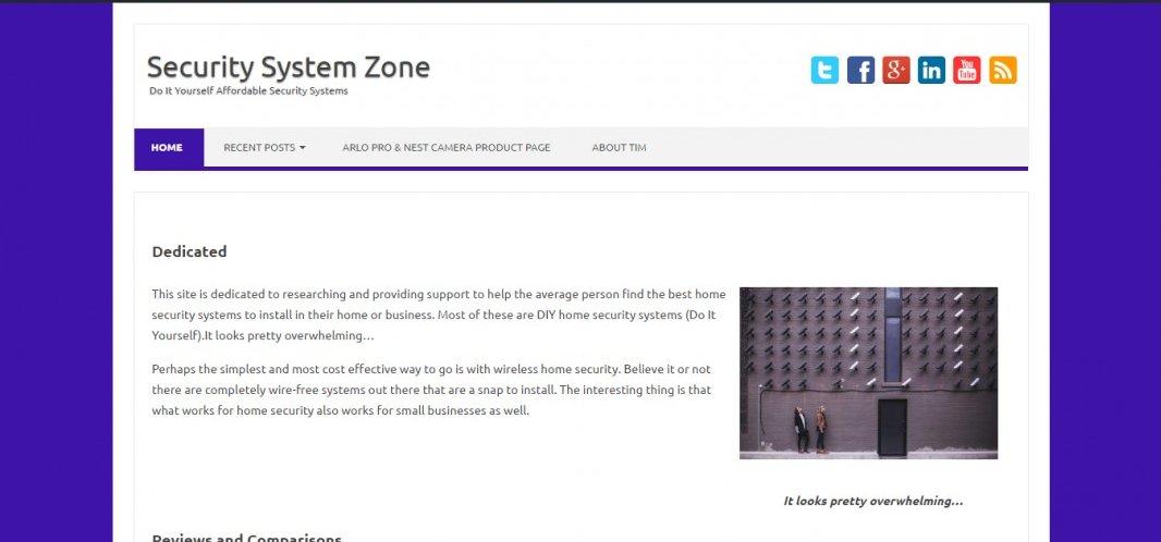
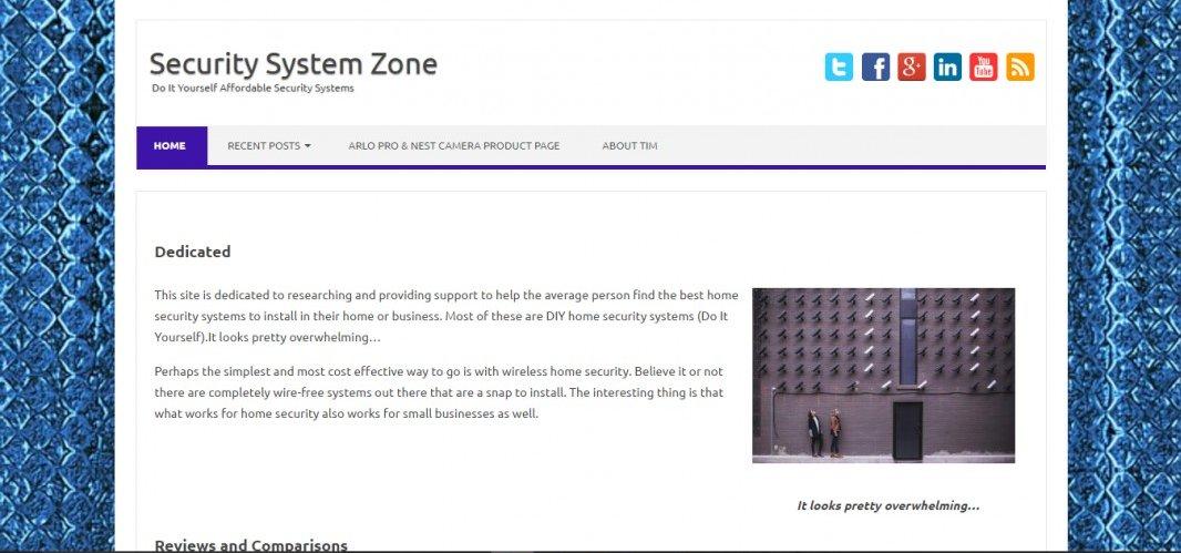
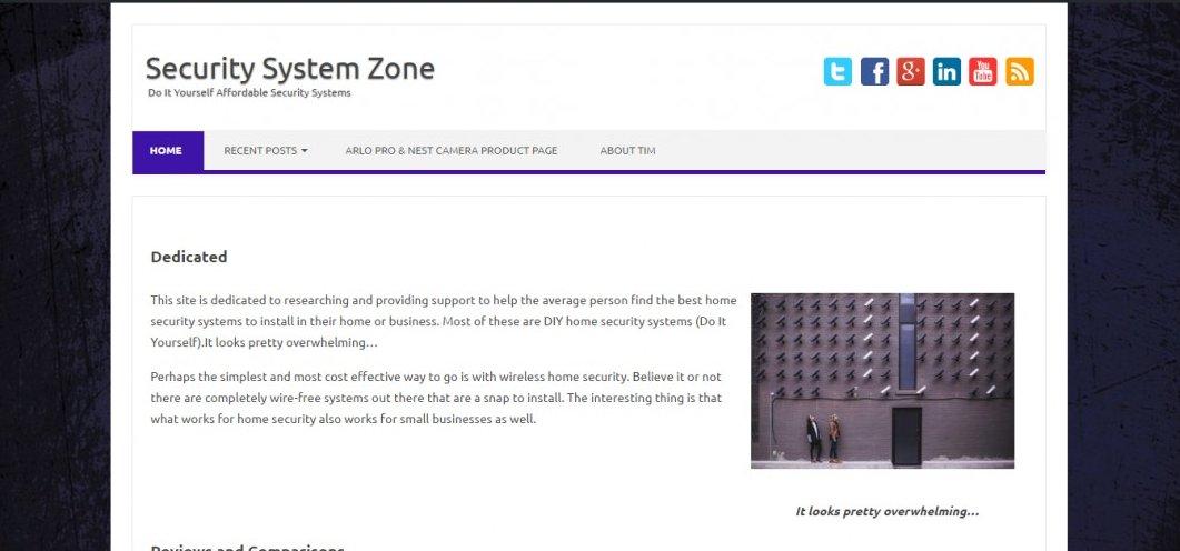
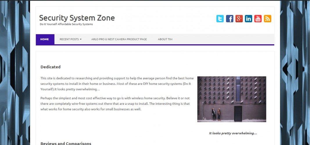
I got some feedback that my site was a little plain and needed to be more masculine or futuristic or something to go along with the security theme of my niche. I was using just the plain blue background which I've included in the first image. The other 5 images are alternative backgrounds to make it more masculine or futuristic.
What do you think? Your opinions, whatever they are, are highly valued!
Thanks,
Tim


Recent Comments
10


ok so that's 3 votes for #3. I'll change it to that :)
check it out live:
http://securitysystemzone.com
Pretty cool. I like it!

I think the black one you want it to look quite serious because it's a serious sort of niche. The blue is ok but maybe a darker blue that one seems a bit purple to me but I think a plain one would be best. (Just my opinion).

better than the plain blue (first one)?
my girlfriend likes the one with plain blue (the first one) best and then the one with bars (the 4th one) as a second choice...
See more comments
Thank you so much everybody. Number 3 is winning going away! If that changes, I'll go with another one. For now I will go with #3!