Daily Tips 1


Hey everyone!
I am starting a daily blog with a shared tip from the cobwebs of my brain, lol
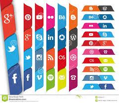
Today's tip is one of my biggest pet peeves of website building, the social button tab!
I see this on websites and it drives me batty personally, and I am sure many of the people doing this do not even realize how annoying it can be.
I am talking about two things, the floating social bookmarks bar and the bar that is located about half way down the LEFT boarder of a website.
The reason the first one bothers me is simple, if I want to play catch me if you can I will play a video game, lol.
The second one is a bit more technical, it covers over any text and forms you may need to fill out to subscribe or leave comments! I usually click out of these websites that use these.
Remember, not everyone has a large screen to view and on some of the smaller screens those tab bars on the left really do get in the way!
That is our Monday's tip from the cobwebs!
Shawn>>
Feel free to share any tips you may have or express your views on the tip of the day in the comments below!


Recent Comments
19


Ill try to remember this in getting my site all straightened out. What do you suggest, no share bar at all or put somewhere else better? Thank you for the tip Shawn. I wish you great success and a wonderful week ahead.
Train, Learn, & Create Your Best Self,
Teresa

I agree about the floating bar..drives me crazy. Not sure what you mean about the other one, but have been on sites where I was unable to read what they wrote because of it being hidden.
I too, click on.
Thank you for the tip.
Linda


Could not agree more, they are now starting to take up so much prime real estate...landing page above the fold! also, they seem to be getting bigger rather than smaller or discrete.
Just not sure why website builders are so keen to send the visitors away again!

Just a note. I use the Monarch plugin from Elegant Themes. It creates the side tab, but they are responsive and don't cover anything. On mobile, they go away almost entirely and become a semi-transparent bar fixed at the bottom of the screen.
You're right. Most interfere with the user experience and that's bad mojo.
See more comments
I agree with this 100%.
Glad you like it :)