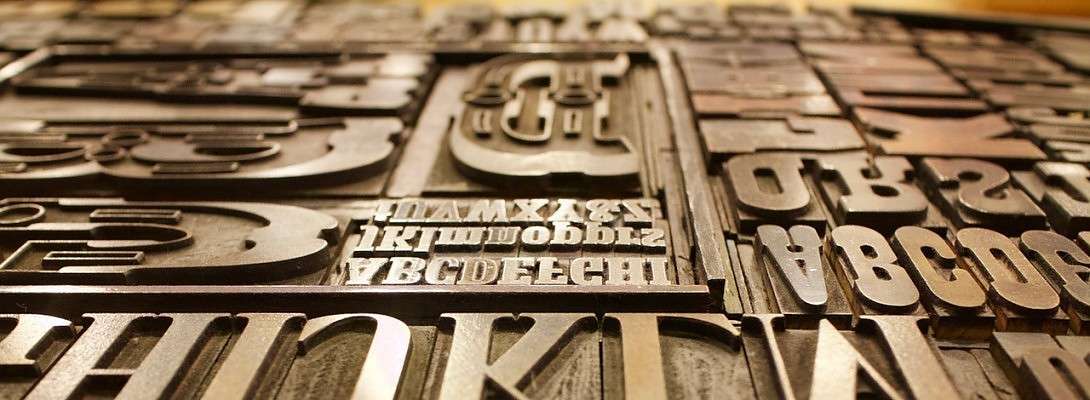
Fonts


If you’re like me, a newbie, you’re struggling with which font to use on your websilte so that its easy to read on all devices. Let me share with you some things I found out about this issue.
The type of font you choose will determine how easy it is for people to read your content.
What that says is that all fonts matter (yeah, a little play on words there LOL).
I researched this on the Internet and came across this article:
https://www.bloggingcage.com/fonts-for-websites/
If you don’t want to take the time to read the entire article, although I would recommend it, there’s a lot of really neat info in it, I have listed the 12 recommended best fonts for your website.
· Arial
· Georgia
· Gotham
· Helvetica Neue
· Lato*
· Merriweather*
· Montserrat*
· Oswald*
· PT Sans*
· Roboto*
· Tahoma
· Verdana
Then you have the chore of seeing which ones your theme supports. The one’s asterisked are the ones my theme had. My favorites were PT Sans and Merriweather. I choose Merriweather with a font size of 15px.
The spacing between the lines is also important. The best font will still be hard to read if it’s all cramped together. I choose a line height of 25. After every change, I checked the appearance on all devices.
There’s no such thing as too much information, so have fun experimenting with the different fonts, font sizes and line spacing. Create the most awesome website you can!


Recent Comments
15


See more comments
Thanks for sharing this information.
Mary