Logo & Brand Redesign - Feedback Appreciated!


NEW LOGO TEST DRIVE
Hi guys just simplified and got a decent outcome! ( in my idea)
Still working on fonts and colors but the design is done!
THank you so much for help, suggestions are welcome
cheers
Pedro
PS: Transparent background ;)


>>>>>>>>>>>>>> UPDATE 14/11 <<<<<<<<<<<<<<<
Based on all your feedback I will upload new versions of my logo.
Thank you so much for your time and help.
Cheers
Pedro
¤¤¤¤¤¤¤¤¤¤¤¤¤¤¤¤¤¤¤¤¤¤¤¤¤¤¤¤¤¤¤¤¤¤¤¤¤¤¤¤¤¤¤¤¤¤¤¤¤¤¤¤¤¤¤
Hi folks, I'm designing my brand logo and I'm sharing with you guys in first hand so I can get some feedback!
I really appreciate it guys!
Old Version


New Version


***** UPDATE *****
Kind of updating as I get feedback!
The big one was kind of whole brand and I designed it 600 x 600 so I can make it smaller without loosing quality!
Here's a small version of the Logo

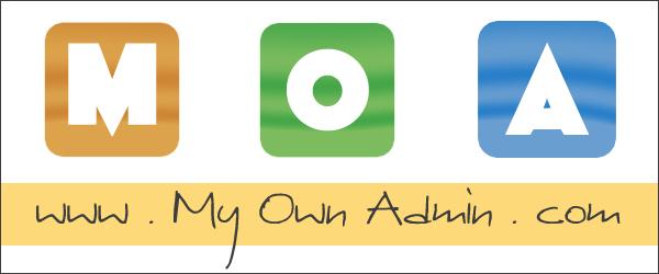
Cheers
Pedro | MOA


Recent Comments
33


You need to simplify. There is a lot going on in both logos.
too many fonts
gradients
multiple icons
Your logo should be simple and easy to read. Some of your information could be used in a tagline.

Thnx Lorrie,
I just dumped that, and started from scratch, just updated with the new Idea :P
Much simpler!
Cheers and thank you

Need to go much simpler. Gradients are old news and will make your site look immediately outdated. Scrap the big version entirely, but the smaller one might be salvageable.
I don't have any gradient there just outside yellow brightness on myownadmin with 50% transparency that goes above the M O A and other icons..
But now that you mention kind of give gradient aspect...
I'll pick up all feedback and place updated images asap.
Thnx 4 your time

As a logo, I like your smaller version. I would change it a little, by removing or reducing the spaces between the letters. I would also drop the www. It's not needed anymore and looks outdated.
Just my opinion.
the idea of www was to center the text with the image...
I just dumped it all and revamped, updated with the new Idea
Thank you for your help ;)

For the big version:
I think it is a little too busy, with "My Own Admin" below the "MOA." Maybe you can just combine them together, and highlight the initials.
The little icons (the speaker, click, and money) are kind of distracting to me as well, and maybe not good for lower quality printing in paper.
I'd also recommend adding an "!" at the end of the "Be the one in charge of your life" to make the emotion even stronger.
For the smaller version:
Again, I think it is better to combine them together, and highlight the initials.
My personal thoughts only, I'm no designer at all. Hope this can help.
Have you ever try some websites before? I know in some sites you can have designers bid for your design, and you can share their designs and collect feedback from here afterwards.
Not sure if I should post the site or not, might be in trouble promoting the site. Please PM me if you want the link to one of the sites.
Thanks,
Hugh

I like the new graphic but it is too big as a logo. You can use the graphic somewhere prominent on your web page(s), but you need a shortened version for your header section.
I had to read your tag twice to take it in. "Be the one in charge of your life" is a bit long. Is it possible to shorten it so it sticks or resonates with your audience? You use "Become your own boss" below. Would that be the shorter and easier to remember hook? Or perhaps some other commanding tag like "Take charge of your future"?
Otherwise I like the logo and layout scheme.
Just my two cents...

Kudos Pedro. Very impressive. Here is my feedback:
General:
Old version looks classic - like on classy business stationary
New version looks NOW, and very oriented to on-screen impact
Pros:
You are making it happen - logos and branding can be powerful, but only if you do something with them & keep at it.
It is colorful, sharp, easy to read and understand - it says a lot
The images say as much as the words
It hangs together
Cons:
A brand logo is like a permalink - it becomes more valuable with age, so changing it always comes with substantial cost and risk
It's big - very hard to carry much of this brand look / logo on each page or post, much less emboss it into a video - the size and design limit flexibility in application
So many colors make it hard to carry standard colors that are part of the brand and communicate brand with simplicity and flexibility
Overall:
Depending on your target, your objective and how you intend to use it, this could be great. While I have a strong professional preference for compact, monochrome logos that carry the message against nearly any background, that's not for everyone or every objective. I think you are way ahead of most folks here in the branding area, so long as you apply the brand with a sensible, well designed strategy, and you keep at it.
Cheers,
Steve


Is there a version without all of the icons and all of the wording? What does your logo look like without that.
I think as a package, this looks good. I would recommend that you have a more simple image that you can use though.
Hi Kyle, I just designed the whole thing together, still up for brainstorming!
My idea was kind of keeping the " M O A " and the URL but then wouldn't be very intuitive for people!
Thnx for your feedback!
Cheers

Good evening Pedro,
I think it has improved a lot. You will not miss seeing this for sure.
Where does one see it?
Greetings from the south of Spain, Taetske
p.s. perhaps a screenshot of it would be good.
I placed both images in the post, the old one, and the new one!
Didn't understand your "PS" you asking for a screenshot of what?
Cheers
Ohhh the old one i use it at myownadmin.com
The new one is still under work.
Thats why I asked feedback ;)
Ok, Pedro, now I got it.I went to have a look and in case you keep that nice big photo on your front page I would not change the logo to the new one as it gets too colorful for my taste.
I saw where your comment section is. I wonder why you have a black background for your replies, a bit difficult to read for people whose eyes are not so good anymore.
Greetings from the south of Spain, Taetske
Probably i messed up the CSS code while editing other stuff. Need to take a look at it.
Thnx for bringing that up ;)
See more comments
I also think this is a bit too busy.
In advertising, always pay attention to what first gets your attention. Look at some other sites yourself to see what catches your eye. You want people to see "www.MyOwnAdmin.com" but what they see is M O A first with no identifier.
I suggest reversing the order seen by making www.MyOwnAdmin.com a larger (not huge) type size than MOA while highlighting the M and the O and A of the web page link in a different - bolder - color.
Good luck!
I made like an Outdoor...
I started simple but complicated... The idea was to forge a new image and for that, I needed to brainstorm.
you guys helped a lot
thnx for your comments