Is a Relation between Header Illustration and Content Necessary?


My father used to say all the time: "Yes, that's logic." It always made me itchy, because I thought the right expression was "Yes, that’s logical." But that is only semantics because otherwise, I seem to think at least as often as my father that something should be logical or make sense.
Illustration versus subject
A painting, a drawing, or a three-dimensional work can be autonomous art expressions. They don’t need to have any relationship with a story or an idea. However, if these art expressions are intended as illustrations, there must be some connection in my view. A connection with the text, or with the subject, or with the niche of the business that posted the article.
An illustration can be used in several ways
- Attracting attention
- Interruption of a large amount of text
- Informative
- Explaining
- Decorative
Different types of illustrations
- Photos
- Drawings
- Cartoons and animation
- Icons and symbols
- (Info)graphics
- Floor plans and expanded views
- Mind maps
Having an illustration in the website header


The header of a website about investing money
An illustration can be very obvious, such as money, piggy bank, and calculator on a website about investing. Not exactly exciting, but images one would expect.
The images will be more interesting when you have to wonder for a moment. But you shouldn’t have to make wild guesses or be puzzled.
What will happen if the riddle gets annoying?


The header of a website about management, psychology, and philosophy
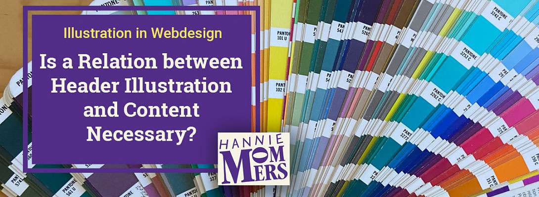
I was browsing the internet, looking for information about psychology tests. At one point I ended up on a site that was about management, psychology, and philosophy. They had a PMS color fan as the header image.
House painters use a RAL color fan to show their customers colors and also use it as a reference to mixing the colors to the right hue. Graphic designers and printers have a similar system, called PMS, Pantone Color Matching System.
I don't understand why a Pantone fan is a clear illustration for a management website. As I don't understand the colored pencils I saw 10 minutes later on a website for entrepreneurs.


The header of a website for Dutch entrepreneurs
Of course, I can make educated guesses. Managers and entrepreneurs are colorful, versatile, and diverse. But it is too far-fetched. People are being misled in my view. A PMS fan belongs to a printing company, crayons are the tools of an artist.
What do you think, am I judging too harshly? Or do you also think there should be some logic in an illustration?
Take care,
xxx
Hannie
Oh, and another interesting question for me as a non-native English speaker: what is the correct use of logic or logical in my first sentence? :)


Recent Comments
34


Hi Hannie
The first sentence "Yes, that's logic" would be a good answer to a question "Is the expression or presentation of one rational argument or statement that leads to another, logic?"
On the other hand . . .
"Yes, that's logical" would be a good answer to an example of a rational argument or statement that leads to another. Sorry if I am disagreeing with other answers given but to Rupert's point "Yes, that's logical" sounds right because it was probably the best answer to that question. Maybe we should ask an English teacher to chime in.
As regards the pantone color spread on the header of the management website, at least it provoked your interest and got you asking a question. If it had just turned you off it would have failed.
Best regards
Andy

Yes, Andy, it got my attention and annoyance. The result was a question and a screenshot of the header. And then I left, I saw nothing of the website itself. Which was probably not the intention of the website builder.
Or maybe it was, and I was clearly not their target audience :)
LOL, logically it is still difficult for me to feel the difference. It is so clear to me in Dutch, but English... not so much. :)


Hey Hannie normally I would say that there should be a sync between your header image and body content. However I have seen images that draw you in and the content has nothing to do with the header. I guess the strategy is that a few people would continue reading perhaps on a subject they typically would not have if they knew about it before. It's a law of numbers thing in the second instance I think.
Hugh

Hello Hugh! Yes, I agree, normally. I think Hannie is a special case :) What I mean is that I expect her content to be interesting because the pictures she chooses say more about the writer than it does the content so it sets up some sort of expectation that what will be written is fun and exciting. So in some sense, the image and the contents really work well together. They are connected to her personality.
Ah gotcha. So really it depends on your own circumstance is what you are saying. No one size fits all
My opinion and recommendation usually is: be aware of the rules, learn them by heart, and then break them whenever applicable. I am speaking about web design, not about life events here :)
So yes, I can certainly imagine situations where it is useful to have images that are not related to the content, yet draw people in. Most of the time the internet is just too airy or volatile or whatever translation I should use, to make the correct impression. Especially in a header which is the first thing people see.
Thanks, Hugh and have a great weekend.
I would like to invite @TheCatherine to comment on your question about English. From my understanding, she is very good at English grammar :) I hope my memory serves me right, as I have a faint distant memory of one of her posts about English. Rupert.
See more comments
I would want the picture to compliment the content unless the author was making a specific point and knowingly chose not to. The pencils for example -- it leaves each reader to your own interpretation then it becomes a matter of 1- do you find the picture pleasing to the eye and 2- are you intrigued enough to see if there is an explanation.
Your last question is it depends. If someone described logic to me but wasn't sure what they were describing and asked me. I'd say "That's logic"
If they described a situation that made sense to me, I'd say "That's logical"
Hopefully all this makes sense to YOU. lol
~Debbi
I guess, Debbi, I am also set off by the pencils because they are tools I use for different things than business. While writing: yes, that's it - pencils are for relaxation, not for business. :)
But you are right, it highly depends on the eye of the beholder.
OK, that's logical. LOL. Most of the English I sort of feel whether it's right or not. This not. Yet. I'll learn in due time!
You do really well.......better than some natives I might add. 😉