In der Beschrankung . . .

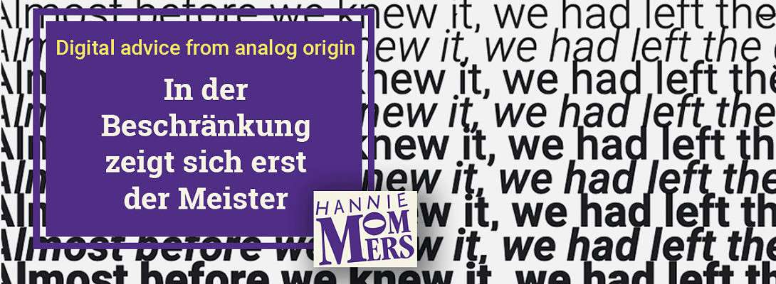


Digital advice from analog origin (7)
Anyone who reads my articles more often knows: I love my (previous**) profession very much. And many with me, both professionals and laymen. With a few clear guidelines, the latter group can also make a good design.
Do you have a favorite brand? Or maybe more than one? I do. Apple, FairTrade (though, that's not a brand, it's an indication), Sloggi, Solgar, YourSuper. And some Dutch ones, but they are so national that hardly anyone knows them.
If you have a favorite brand, you probably recognize it from a distance, without really being able to distinguish a logo or even words.
Consistency
The reason for this is that these brands have a fixed corporate style. A fixed way to use font, sizes, lines, colors, photos, concept.
In the past, when I got an assignment for a corporate identity, I always made a paper with instructions for use. And if it was a house style for a large organization, that paper grew into a whole book, the corporate manual.
Sometimes I got an assignment for a folder or a brochure from a company that had been around for some time and usually, I received their corporate manual, so that I could follow the corporate identity guidelines. In this way, consistency was guaranteed.
In der Beschränkung zeigt sich erst der Meister
This is a German saying and means that mastery becomes apparent in the restriction.
Of course, it is more fun if a designer can show her or his own style in a product. But this often turns out to be disastrous for clients. They benefit from consistent use of the elements.

For example letters
The biggest pitfall is to lose ourselves in all the possibilities that are available. Looking at just one font, the possibilities are:
- Different font sizes;
- Several ‘weights’: extra-bold, bold, normal, light, thin, extra-thin;
- Variation in the appearance of the letter: italic, condensed, extended.
And then there are:
- Thousands of fonts;
- Millions of colors.

The best tip
The best tips I can give to anyone with a website or a computer with a word processor program:
- It’s great to try all the variations that are possible, but use just a few in one document;
- Take the purpose of a text into account (readability in both aspects - design and language);
Let me know if you have any questions about this topic. I’ll be happy to answer!
Related
My other blogs on what we can learn from using traditional resources in contemporary design:
https://my.wealthyaffiliate.com/hmommers/blog/what-does-above-the-fold-mean
https://my.wealthyaffiliate.com/hmommers/blog/fundamental-text-design-for-a-website
https://my.wealthyaffiliate.com/hmommers/blog/invisible-grid-in-a-wordpress-blog
https://my.wealthyaffiliate.com/hmommers/blog/what-is-the-best-font-for-a-website
xxx
Hannie
** Why do I say “previous”? Because I am retired, or at least, I keep telling myself that, LOL. In practice, it means that I no longer accept paid assignments. But the love for my profession is not expected to disappear. :)


Recent Comments
20


Fontastic Hannie, very interesting article, but you are interesting as well.
Nice to see the work you do. I had no idea, and I'll be back to partake of >>>> some more fascinating topics over there...>>>
Your friend,
Suzay
I am doing well Hannie. I am healthier, found out last year that I'm gluten intolerant, and without foods with gluten I am thriving, energy is back. That part alone is a tremendous improvement! And Celiac's is not any good for Congestive Heart Failure survivors.
Of course Medical doctors don't tell you that the vitamin B1 is #1 preventative for CHF.
Vitamins are not medical doctor's area of expertise, that is why!
Cutting and Pharmacy are what medical doctors specialize in.
And Niacin, another B vitamin is helpful to any one who has a
That's so sweet to say, and I appreciate you too ❤️😘
It's quite stupid that doctors only want medication and operations, but I am afraid you are quite right there. I am so happy that you discovered what vitamins are helpful for you!
Such a pity that you were only able to take advantage of WA for half of the time. But I am sure better times are coming now. :)
xxx
Hannie

Hi Hannie
This is a very informative series of posts. Thank you.
I often use Tahoma or Verdana ... do you have any opinion on those?
Thank you
:-)
Richard
Thanks, Richard.
Both Tahoma and Verdana are clear-designed fonts. They differ in the size or the space they take - Tahoma is smaller than Verdana / Verdana looks a bit more 'blunt' than Tahoma.
Both are good fonts to use. :)
xxx
Hannie

Hey morning Hannie I am actually at the stage of trying to develop a couple brand documents. Do you by chance have or can point me to a template that will guide me that I can fill out?
Hugh
PS Don't think I missed the change in the profile shot....me likey!
Thanks, Hugh, I haven't changed it in vain then :)
Maybe templates exist, but I haven't used any. What is the use you intend? So that others can work within guidelines? Because then it's a matter of trying to think of anything that is fixed, like fonts and sizes, colors, etc.
If you want me to have a look at them when you're done, just ask me. :)
xxx
Hannie
Thanks Hannie. I am trying to develop the email marketing and retargeting documents. When I build them out will send to you to see what you think if that is okay. Thanks again.
Hugh
See more comments
You always have an important gem of wisdom or information to impart, Hannie, and they are always very much appreciated!
Jeff
Marvelous to hear that, Jeff, thank you so much!
xxx
Hannie
You're very welcome, Hannie! Enjoy your new week!
Jeff
You toooo :)
Will do!😎👍