Hamburger Helper


Do you know what hamburger is for your website ?


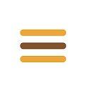
Its that mobile menu on your website when looked at through a mobile device.
It has has three lines going horizontal. Which is why its called a hamburger , pretty cute words coders lol
Stats show that...
Adding the word "menu" underneath the three lines increases the button being used more than 7%
Putting the hamburger inside a box or shape looking button increases its use at 22%.
Switching out the lines for the word menu makes 20% more people use the button....
In conclusion , its probably more likely, in my opinion, your menu would be better off a normal menu as it seems people click buttons or obvious menu words...
Want hamburger to go bye bye and just have desktop view on your site ? Put this in your custom CSS ( I am not responsible for anything you do wrong , and please research cache and how to find custom CSS and everything please)
*note ; Doesn't work with navigation scroll menus , unless you add more code.
*
/*Hide Hamburger, Show Desktop*/.mobile-nav-toggle-label {display: none !important;}@media only screen and (max-width: 768px) {#header #headerNav {display: inline !important;}}


Recent Comments
4


Way to be appealing to traffic Cass. Good points!
Thank you !