Redesigning Your Navigational Experience.


One of the most important aspects of any user experience (UX) is the way in which you can navigate the platform, and whether the navigational properties of a website are inherently intuitive.
One of the problems with any software or internet company that grows their offering, is that often times their original idea for design is not suitable for what the future of their platform will become.
That is certainly the case with Wealthy Affiliate and the current state of the design. You will find that many of the ideas that came after the last design are integrated, but often times not as seamless as we would have liked.
But there is a catch 22. You cannot “redesign” a platform with every iterative release, and this is why we typically update the UX here at Wealthy Affiliate every 3-4 years. We Are Being Diligent, We Are Planning for the Future
When you design something, it is often times difficult to take into consideration the “unknowns’ of the future. Fortunately though, there are A LOT of unknowns in our/your future here at WA as we have already slated out our roll outs right through 2019.
This will give us 2 years of anticipated updates in the design, but we will always remain flexible based on what the WA community wants, demands, and needs to operate and scale their business. So to a certain degree, there will always be a certain level of unexpected updates. In saying this, the navigation and design we are rolling out leaves room for what have planned in the foreseeable future, but also leaves from for additional features, platforms, and technology.
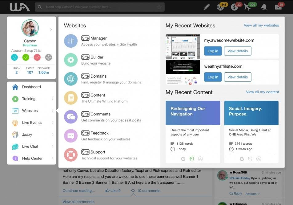
Running out of Colors in Rainbow
One change you are going to see is that we are moving away from the Rainbow. It had a purpose when we rolled it out, to draw natural attention to certain items. But as we integrated new platforms and offerings, with the latest being Jaaxy, it started to get out of control.
To be completely frank, we feel that our current menu looks tacky.
In our new design, we have moved away from colors and moved towards a much more interactive, responsive, and user focused menu structure.
Let’s look at the comparison between the old menu and the new one.

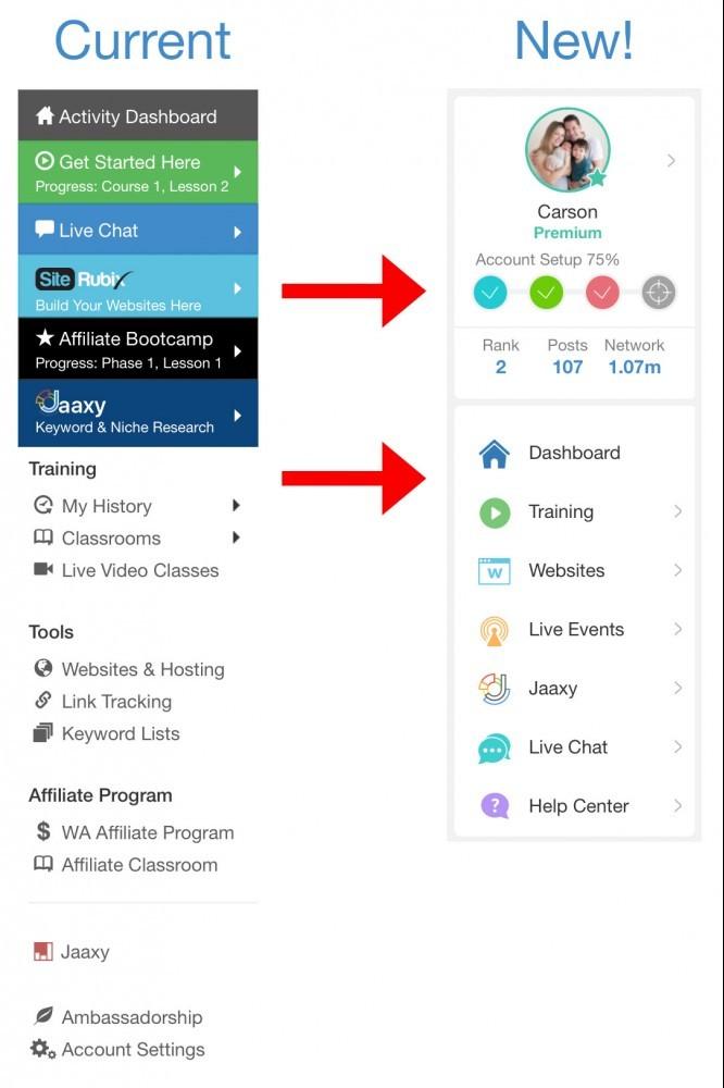
You can see there are some vast differences in the main navigation, and these decisions have been made to remove a lot of the redundancy (duplicate ways to find the same thing), clarity in terms of naming conventions, and the design is much more clean, crisp and easy to use.
Name Conventions Are Critical. Formerly, We Failed.
If I say “SiteRubix” or “Jaaxy” to you, you likely understand what I am talking about. SiteRubix is the website platform here at WA, Jaaxy is the Research platform built into WA.
Affiliate Bootcamp. Get Started Here. What the heck do those mean? Yeah, you start to understand the differences and where to go once you go through the walk-through video (which explains it) or you spend some time immersing yourself here at WA. But it isn't logical where to go to see the training.
SiteRubix was brand move, but was illogical. Sometimes ideas and a focus on branding can be self-motivated, but ultimately they make absolutely no sense, especially to someone who is brand new, excited about getting rolling with starting their online business. The last thing that people should have to worry about is navigation that is not intuitive.
For example, in the new UI, if someone wants to get training they now click on "Training". Training and the portal into all training at WA is found in ONE button, with ONE click. Seeing your courses, navigating to OEC or Bootcamp, or to training that you have recently been working on is now visible in one place...naming conventions make sense!

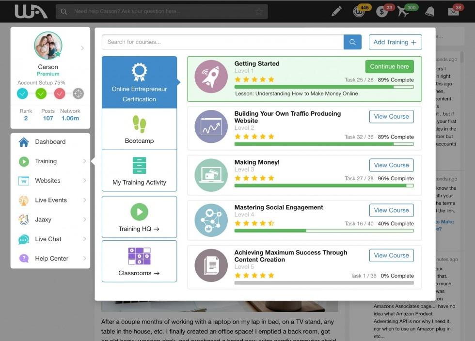
As you can see, the organization has been vastly improved and this of course is iteration #1, we have lots of really cool stuff planned for the Training platform here, and people are going to be able to create, manage, and track their training in entirely new and interactive ways. The labeling conventions and using proper labels will lead to newcomers being able to understand where to go to actually get their training. Labels like "Get Started Here" in the menu, didn't reflect that was the location where the "core" training was housed.
You are going to see advances within all the main menus, and proper labeling to help make the navigation much more intuitive and understandable for our collective audience.
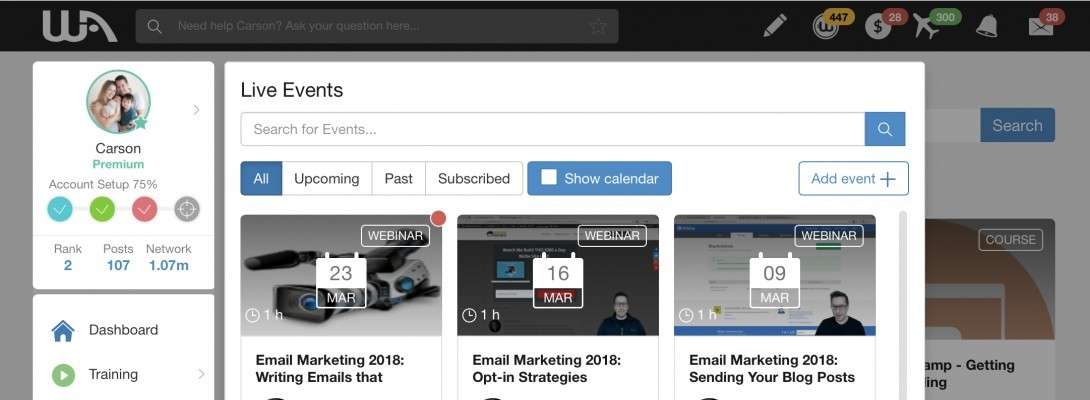
We have also included "Live Events" within the menu now. All Starter members will now see the Live Events taking place (formerly they couldn't even see them, ugh). Premium members will now be able to see the full schedule of events that have taken place, and that are scheduled for the future within our beautiful new Live Events platform.

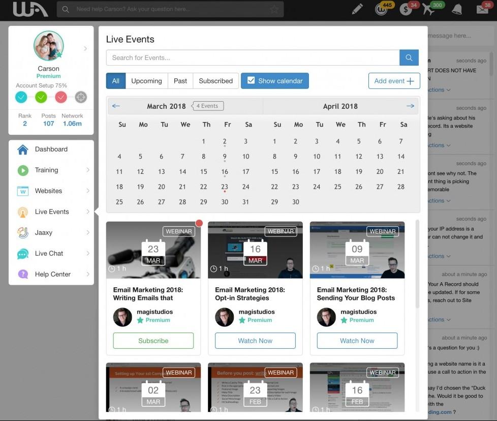
It is going to make navigating much more efficient and it is going to create excitement about upcoming live classes that will be taking place. As with ALL platforms here, we have some awesome plans for the Live Events platform as we move through 2018 and into 2019.
The Two-Click Approach
One of the objectives that we focused on with the new UX is allowing for things to be found much easier, quicker, and without so many "hops".
For example, our new Website menu has a similar feel to it as the current design, but we have an added element that allows for you to get to your recently worked on websites and recent SiteContent drafts right from the menu. This means logging into your website with fewer clicks, it makes getting to your website details a cinch, it means knowing where to find your websites a non-issue.
Currently it's actually quite tough to find where your websites are when you are brand new to WA. You have to know that "SiteManager" is the dashboard for your websites, and you have to guess that "SiteRubix" is where you access your websites from. In our new "Websites" menu it's just one-click away to get see our recent sites...zero confusion is the goal.

And Yes, Mobile IS Coming.
We have be developing a mobile experience alongside the desktop/laptop experience that you currently have. We have put a lot of thought into the mobile experience, and this includes the navigation as well.
Although the complexities are vast with making a mobile experience useful, we realize that it's something we absolutely NEED at WA. We're working hard on it.
With the first iteration of the new UI we will not be including the mobile experience. This is on purpose so that we can learn from the real-life engagement and use of the new platform. We want to get feedback on the new UI, see how YOU like it, how YOU use and interact within it. We can then make adjustments to both the desktop version of WA, and build this into the mobile version.
The desktop version of WA will certainly work on mobile devices, but we'll quickly be updating the platform to allow for a much more polished experience on mobile devices.
Influence Comes From Everywhere.
Everything you do in life and in business, is in some way influenced, or is the result of a past experience (or your interpretation of it).
The design of our navigation is no different. When we sat down to decide on what should be put where and why, we leveraged a lot of experience, feedback, and our own intuition in our thought process.
We also use outside influence, naturally. All companies do. We have looked at what is "current", the latest technologies that we could utilize and over the past 3 years, we have taken a lot of the best design ideas/experience and created a "design board" that we are leveraging with the implementation of the new User Experience (UX) at WA.
Nothing is perfect and this release is no different, and that is what excites us. Our strive for perfection though will continue to evolve to levels we could have never imagined. The new User Experience within WA will be a great one, we absolutely love using it ourselves and we have been using it as we put the final touches on the platform prior to release. We feel that the new experience is truly our "best yet" though and we are really excited to get this into your hands in the coming weeks.
We would love your feedback and thoughts on the new navigational designs!


Recent Comments
250


Everything you do just gets more exciting gosh I wish I was there testing it first hand.
Hey I am here ready for the changes and more so for the excitement to follow.
Thank you so much.
This I must add to you Yourself Carson and to Kyle too. Please thank your Wife's and your children for sharing your time with us all.
Gosh my life here in W.A. changed completely and my children's too even though they are teens now they are so proud of me.
They know who changed their lives. They happen to love the W.A. platform. My kids are great kids too.
So Thankyou so much to both your wife's
and your children.
Thank you so much.
~Deborah :)

Hey Deborah, great feedback and it really makes me happy to hear that WA is having a positive impact on you and your family. Your kids have a mom who is an internet entrepreneur, learning very cool and cutting edge skills. I can see why they are proud!
Our wives and children are very good with sharing our time with WA. They believe in what we do, why we do it, and know that we are passionate about our work. They are the #1 supporters of WA and truly allow us to do what we do :-)

Thank you Carson for all the work you have put into this for all of us as well as new comers.
I think the way you are introducing it is awesome and will let us ease into it.
Although I am REALLY excited to get right into it.
I really appreciate you , Kyle and Jay as well as all the members here.
Like Dorothy said " there's no place like home". : )
Y'all have made my second home feel AMAZING.
Lee Ann

This does look very interesting. While this, what I consider to be a nuisance, doesn't really apply to navigation I've been meaning to put something out there.
When we write our blog posts here at WA and we go to the next line it will automatically give us that bit of white space. When we are commenting we actually have to hit the enter button twice.
I haven't found a way to change that and it's a little annoying. Will that also be getting a bit of a tune up eventually?
Take care!
Hey Michelleanne, there is a technical explanation for this which I’ll spare you the details of. Definitely something we can address, thanks for your attention to detail and suggestion here.

Thanks, Carson. Your approach to the new UX is refreshing and I'm glad you're rolling out the changes slowly instead of all at once. I also appreciate the fact that you're always looking ahead and staying current with changes in technology and how the changes can improve the community's experience here at WA!

Looking forward to the new design. Have you thought of having some focus groups to give feedback on certain aspects of the design? One that looks at say the Bootcamp, another the video training etc. Also offer the focus group to various levels such as new, experienced and average etc users.

Hi Carson, thanks for the headsup on the new UI. It looks modern, simple, and easier to navigate.
I'd like to ask for 2 more little things if you are seeking some input:
- An option to shrink the navigation left panels into icons, so that we can maximize the real estate on the screen, and maybe add a title for the icons when mouse is placed on them
- A drop down menu on top that can be customized, maybe replacing or adding some items in the "pen" drop down menu, I'd love to save the most visited places in the menu if possible
Thank you,
Hugh

I support projects which promote the use of blockchain in increasing trust within Affiliate Marketing. To me improving trust is the number one priority for WA members in expanding and retaining prospect visitors to their websites. If individual believe what we say about WA then they will all become visitors, clients and fellow WealthyAffiliates.

Very nice. It looks like you have done a lot of careful planning and that you have put a lot of thought into this. This is very much appreciated! Thank you!
One small thing I'd like to ask from Kyle and Carson:
Could you please add a video in the official training, where you show perfect examples of existing WA websites and within those WA websites - specific articles, blogs, pages that are known to be veritable money magnets?
I'm referring to things such as what type of language is typically used, psychological approach, page organization/page structure, illustrations, videos, pictures, where inside the actual page to typically place the affiliate links or affiliate shops for the purpose of increased customer attention and increased customer turnout etc. I suspect that quite many people would be interested in that. I'm convinced that all "money magnet pages/articles" have a few things in common that make them successful. SEO is of course important, but bringing in traffic is one thing, turning the visitor into a paying customer is something different.
I'm really looking forward to the vastly improved WA platform!

Could you repeat that? Lol. I am reading this from my phone so corect me if I miss anything.
New is good, you guys have our back, wish Google had felt the same way. A New training was mention way back but was never discuss further or implemented. Is this going to be included as well?
PS: Most of my traffic is from mobile.
See more comments
Hi Carson everything looks great, but I am not good with change so I'm FREAKING OUT, only just got use to this layout!
It's OK I know change is good,I will get use to it, I just may be asking more questions than I usually do, Oh No LOL.
Jenny
Haha, this is exactly why we are "easing" folks in and the transition is going to be dealt with in a way to handle for those that freak out with change (me being one of them).
I think it will take no longer than a day or two to totally get used to, but the design makes much more sense now and we have taken everything into consideration with the existing shortfalls to make WA that much better.
Thanks Kyle, that is reassuring. I AM very excited, just a little scared also. All Good.
Jenny