Weekend Warrior- Site Improvement


Thanks for dropping by!

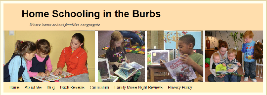
I have spent the weekend working on my blog and trying to follow the recommendations of my WA followers. I would love to know if the changes I made have helped or hindered the appearance and usability of my site. This is what I did (and hope it will achieve):
- Disabled many of my plugins (load the site faster)
- Got rid of the floating Social Button (make my site less annoying)
- Increased the size of my font (12 px to 14 px) and changed it from Times New Roman to Helvetica (make it easier to read)
- Masked my paragraph long affiliate links (increase greater CTR? and give the viewer a better idea as to where they are going next- masked links have fewer characters and gibberish)
- Added more subtitles on the first page (make it easier to read)
- Added a Purpose subtitle to the first page (let people know what my site is about)
Please drop by my site. I'd love to read your critiques! Thanks!
If you tell me you want my opinion about your site, I'll return the favor.
Have a great day!


Create Your Free Wealthy Affiliate Account Today!

4-Steps to Success Class

One Profit Ready Website

Market Research & Analysis Tools

Millionaire Mentorship

Core “Business Start Up” Training
Recent Comments
3
Create Your Free Wealthy Affiliate Account Today!
4-Steps to Success Class
One Profit Ready Website
Market Research & Analysis Tools
Millionaire Mentorship
Core “Business Start Up” Training
I like what you have done with the place. One thing Vendor is not spelled vender. Might want to locate that. It's on your shopping page.
Good noticing. I'll have to find that and fix it ;) Thanks for the insights, too.
Wow! That was 4 times the variation of vendor was used. Thanks. It looks bad when a home school site has obvious mistakes.