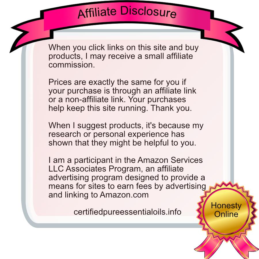
Affiliate Link Disclosure Graphic for my Sites


I've been trying to create a way to include the FTC and Amazon required disclosures in such a way that isn't annoying or disruptive to my readers, while remaining conspicuous. It's been tricky.
My first thought was to include it at the top of the side bar so it automatically appeared on every post I have whether there are affiliate links or not. Then, someone wrote about how important it is to be obvious and that mobile devices might not be able to see it before seeing the link.
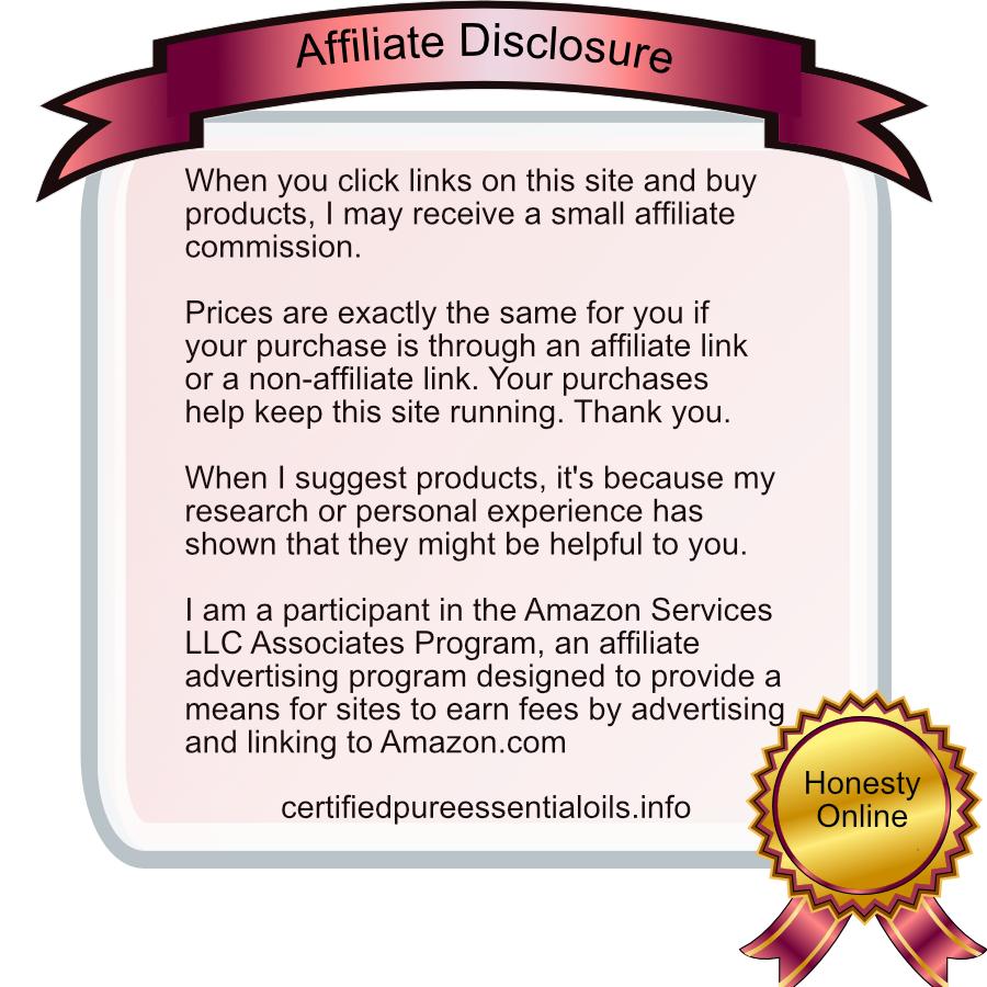
I decided to create a graphic for my posts with affiliate links. As usual, I spent WAY too much time on it, especially since I'm trying to make the colors fit in with my page and look aesthetically pleasing. Here is one of the graphics for just one of my websites. I'm going to edit it to match the color schemes of my other sites.
You can see the first place I put it, which is near the affiliate links at the bottom of this post: View post
I'd love to read your comments about my graphic, it's placement on the post, as well as:
What have you done with your affiliate disclosures? Where do you place them?


Recent Comments
10


wow, very nice! I've no idea how this law is going to work out in practice but some affiliates are wrecking their ux by putting too many notices in too soon, I hope you can satisfy them with this, but who knows! I like the honesty and explanations in it as some I've seen are scaring people off like it is a 'big deal' to go ahead and click the link...if this works you may have a niche in selling these banners :D
I hadn't thought about that! Selling my banners. Thanks for the suggestion.
Thanks for the feedback on the graphic. I never know how someone else is going to perceive it. After working as long as I did to get it right, my brain becomes mush and I get to the point where I just want it done.
Plus, I'm using a new program. I've decided I don't want to pay monthly for Photoshop or Illustrator. I wanted to pay for a program and be done with it. So there's a learning curve.
My older son came and looked at them and said that the graphics look like 2009 and didn't play well with my site. LOL
Thanks! He does have a lot of insight, but sometimes it's better to go with my gut feeling.
See more comments
I think they look great!! :)
Thank you ;)