Typography - The Description of the Written Word.


Typography is the description of the written word. The effortlessness of reading a page, an article, or even a novel, the style of type can determine the ease of transmission from page to brain. Whether the type is fine or bold, straight, or cursive, simple or elegant, this is what is meant by typography.
The way type is used to make a statement,
or to caption an image,
the way it is written can manipulate the senses,
convince it otherwise,
by a simple twist of the pen,
figuratively or literally.
Sound provides the method for intent, same for the language of typography.
Without texture, without flow or motion, words are simply words, used to convey an emotion, thought, or feeling.
In web design, content must flow rhythmically or you’ll lose the reader, who will become easily bored if the information does not attract their interest. The type used to convey the content must subliminally draw in the reader; it magically holds them for a short while until the spell fades, as they are now held captive by what they read or view.
Other factors that can make a difference in the legibility and readability are text color, the typeset serif, or type that has extra endings (Times New Roman), or sans serif that refers to smooth text like (LUCIDA SANS). Black text on a white or light background is most commonly used, where light text on a dark background is also used.
The mixing of colored text on the colored backgrounds can be an issue depending on the color choices. One thing to consider, in web design, is what colors are recognized in which browsers. Some combinations may not work as well.
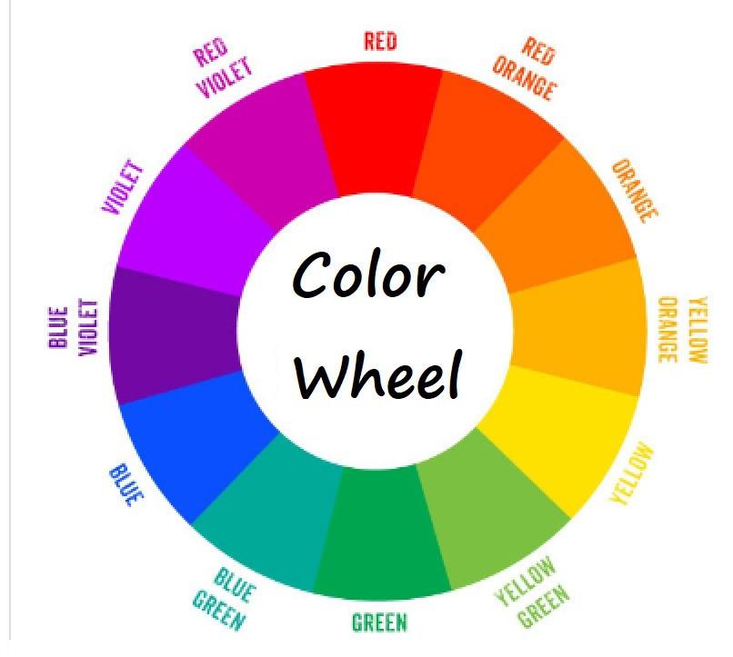
Use a color wheel to help select the primary, secondary, and complementary colors.

No matter what type of font or colors you use when creating your website, make sure they are easy to read. Dark colors on a light background are best for your eyes. White text on a black background is harder to read, as far as blog posts go. For small ads or featured images with little or no text, using a dark background gives you some flexibility when designing your pages.
Fancy fonts can be used in a heading, rather than used for a 2000 word blog.
IE: Comic sans, Cheap Fire, Rock Salt (my favorite, used for my art gallery).they have their place, be selective when using a fancy font type.
Rudy


Recent Comments
26


I discovered cheap fire a few years ago. Go to dafont.com for the best assortment of free fonts you can download.
https://www.dafont.com/cheap-fire.font
Rock salt is a font I found when selecting a font on my website.
Wordpress Default is roboto, and rock salt is a couple fonts away, alphabetically...
Funny tho, I did not find Rock salt font in a search on dafont.
Rudy
They sound really awesome, Rudy
I use Roboto Slab
I will see what the others are like
Thank you, Rudy

Howzit Rudy,
Just had a look at dafont.
Some great Fonts, you good spend sometime going through the whole Lot.
Simone says she uses RobotoSlab, could not find it at dafont.
I downloaded one, when I put my name in, just looked Right for LOGO, will wait and see how I can use it.
Great Post.
Cheers
Murray


I'm partially color blind, and if I click on a website that I can't read, I immediately will click the back button, and find another website that's legible. This has happened to me more than once.
Black text on a white background is the best way to go.
Yes, I'm sure that csn be difficult when visually impaired.
Do you find it difficult to colorize your own site?
Rudy
Yes, it does cause frustration. I like to make it unique, but I end up keeping it simple black on white. It will always save me time.
Yes, keeping it simple works the best.
Black text on white, off-white or very light colored background...
Rudy
See more comments
Great advice, thanks Rudy, We should always be aware of readability. Jenni.
Thanks, Jenni!